Leonardo alternative
The Leonardo alternative with a designer-friendly workflow
Leonardo generates colors from target contrast ratios, and it is seriously powerful. Atmos covers the whole palette journey, from finding colors to fine-tuning shades to syncing Figma, without the learning curve.
Helping 30,000+ world’s greatest designers create beautiful designs.
Why designers switch from Leonardo to Atmos
Leonardo is an impressive piece of engineering. The designers who switch usually are not looking for more power, they are looking for a smoother path through the everyday palette workflow.
Atmos vs Leonardo at a glance
| Feature | Atmos | Leonardo |
|---|---|---|
| Color generator & harmony wheel | ||
| Shade scale generation | ||
| Generation model | OKLCH with easing curves | Target contrast ratios |
| Contrast checking | WCAG 2 & APCA | WCAG 2 based |
| Color vision simulator | ||
| Adaptive theming (brightness/contrast sliders) | ||
| Data visualization scales | ||
| Figma plugin | ||
| Version history & shared palettes | ||
| Export formats | CSS, Tailwind, Style Dictionary, JS, SVG | CSS, W3C tokens, SVG |
Other differences
Two philosophies of shade generation
Leonardo works backwards from accessibility: you specify target contrast ratios and it derives the swatches. That is a clever model, especially for theming engines, but it means thinking about your palette as a set of numbers.
Atmos works forwards from color: it generates perceptually uniform scales in OKLCH with easing curves and hue transitions, and shows you contrast values live as you tune. You reason about how the palette looks, and the accessibility data is always one glance away.
See the Atmos shade generatorThe whole workflow, not just the scales
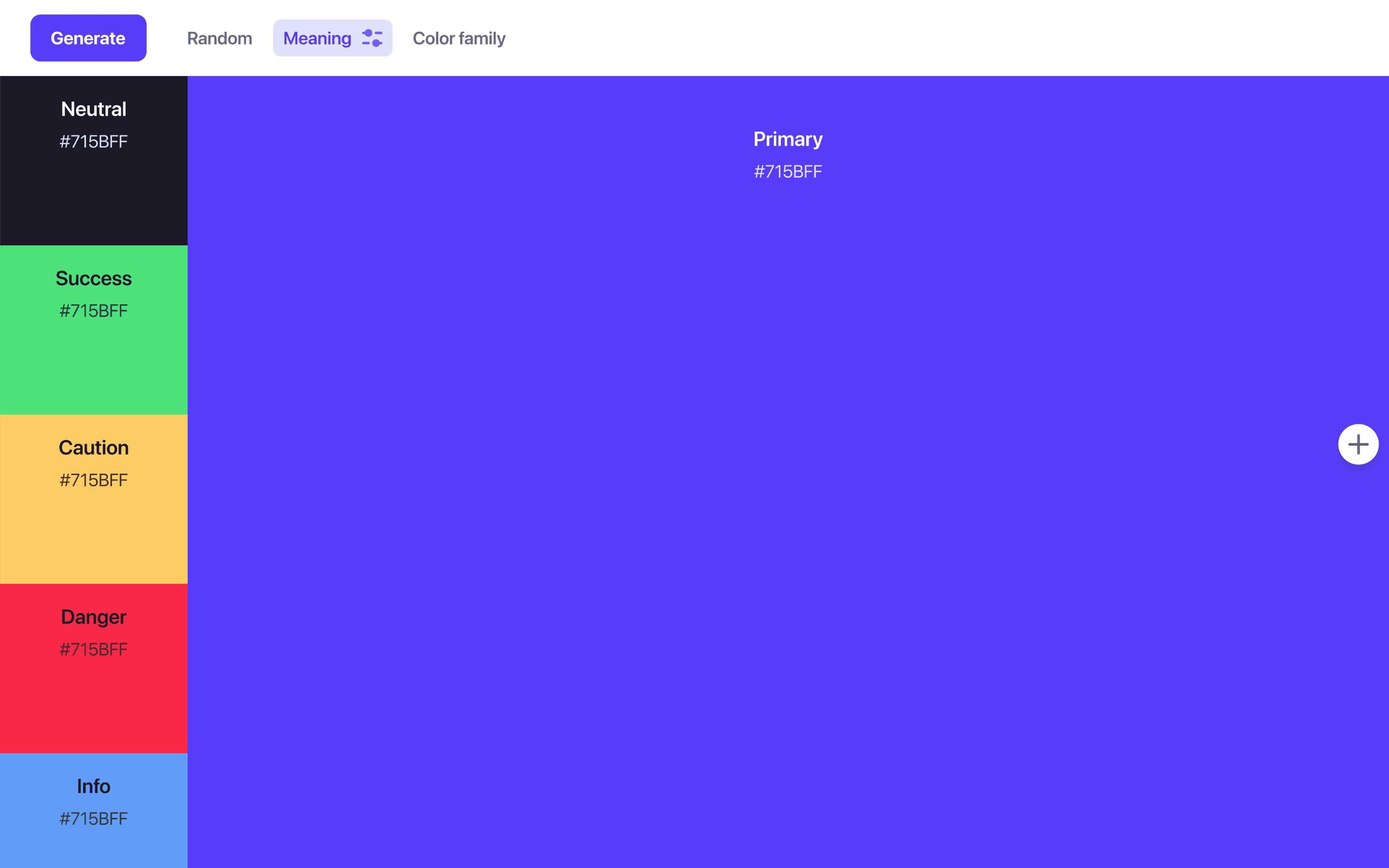
A palette starts before the scales: choosing a primary, finding accents that harmonize, picking semantic colors for success, warning, and danger. Atmos covers that discovery phase with a color generator and a full harmony wheel, then flows straight into shade generation and fine-tuning.
When the palette is ready, it exports to CSS, Tailwind CSS, Style Dictionary, JavaScript, and SVG, or syncs directly to Figma through the Atmos plugin.
Try the Atmos color generatorAccessibility beyond ratios
Contrast ratios are only part of accessible color. Atmos supports APCA, the perceptual contrast algorithm behind WCAG 3 that fixes well-known blind spots of WCAG 2 ratios, and includes a vision simulator that shows your palette through different types of color blindness.
Check contrast with WCAG 2 & APCAWhen is Leonardo the better choice?
Leonardo is free, open source, and uniquely strong at two things: adaptive theming, where brightness and contrast become runtime parameters of your theme, and perceptually uniform scales for data visualization, including colorblind-safe palettes. If you are building a theming engine or charting library, Leonardo deserves a serious look.
If your goal is a polished, accessible UI palette that your design team can build, iterate, and ship together, Atmos gets you there with far less setup.
What are designers saying?

Alex
@MetalHaze
Well, this is awesome!

Hennie
@andyhennie
I was convinced after this read. Their product is actually pretty neat.

SHOWROCK
@shonibareroqeeb
Since I’m not designing today, I have decided to share this simple powerful tool to make uniform color palette with clear accessible checks? Trust me, this will help you in your design system

Matthias Ott
@matthiasott.com
Just bought a lifetime license for Atmos because it is just sooo good for creating perceptually uniform color palettes – including a shade generator, a contrast checker, OKLCH support, CSS export, a Figma plugin, online sharing, and, and… 😍 👉 atmos.style (No affiliation, just genuine excitement! 😁)

Patrick Johansen
@patrickskov
another amazing tool for creating color scales in LCH.

Alberto Calvo
@intemperie.me
My new favorite is atmos.style, which works exactly as I expect, with access to OKLCH color space, P3 color gamut, and visual controls with curves and all the stuff you'd need to create something nice! 💖

Satori Graphics®
@satorigraphic2k
Love your tool and happy to spread awareness 👍🏻

jeremyelder
@jeremyelder
I like working in @atmos_style. Adding all of the variables and quickly selecting a swatch to key off of for contrast is fast.

Abhijeet
@iabhi1610
@atmos_style Best so far

Dusty Pomerleau
@dpom.bsky.social
hue-shifting on atmos is like a drug :)
Leonardo alternative FAQ
Yes. Paste the hex values of your Leonardo swatches into Atmos and it will rebuild them as OKLCH shade scales you can fine-tune, with WCAG 2 and APCA contrast shown live.
Leonardo is free and open source. Atmos is a paid product with a 14-day free trial that includes all features, plus limited free demos of the tools on the atmos.style website, see the Atmos pricing page for details.
Yes. Atmos checks contrast with both WCAG 2 and APCA, the perceptual contrast model developed for WCAG 3, across your entire palette.
Leonardo generates colors from target contrast ratios and excels at adaptive theming and data visualization scales. Atmos is a designer-friendly toolbox for the whole UI palette workflow: color discovery, OKLCH shade generation with easing curves, APCA and WCAG 2 contrast checking, a vision simulator, version history, shared palettes, and a Figma plugin.
Yes. Atmos exports palettes to Style Dictionary as well as CSS, Tailwind CSS, JavaScript, and SVG, so your tokens flow into whatever pipeline your team uses.