Khroma alternative
The Khroma alternative for production-ready palettes
Khroma learns your taste and serves endless color pairings. Atmos picks up where the inspiration ends: complete UI palettes with shade scales, contrast checking, and export to code and Figma.
Helping 30,000+ world’s greatest designers create beautiful designs.
Why designers switch from Khroma to Atmos
Khroma is a lovely way to discover combinations you would never have tried. Turning a discovery into a design system is a different job.
Atmos vs Khroma at a glance
| Feature | Atmos | Khroma |
|---|---|---|
| Built for UI palettes & design systems | ||
| AI trained on your personal taste | ||
| One-click palette generation | ||
| Shade scale generation (OKLCH) | ||
| Semantic status colors | ||
| Contrast checking | WCAG 2 & APCA | WCAG ratings on pairs |
| Color vision simulator | ||
| Figma plugin | ||
| Export formats | CSS, Tailwind, Style Dictionary, JS, SVG | Hex, RGB, CSS |
| Free to try | 14-day trial + web demos | Free |
Other differences
Inspiration is step one, not the whole journey
Khroma does one thing brilliantly: after you pick 50 colors you like, its neural network keeps generating pairings tuned to your taste. As a discovery machine it is genuinely fun, and we happily recommend it for finding a direction.
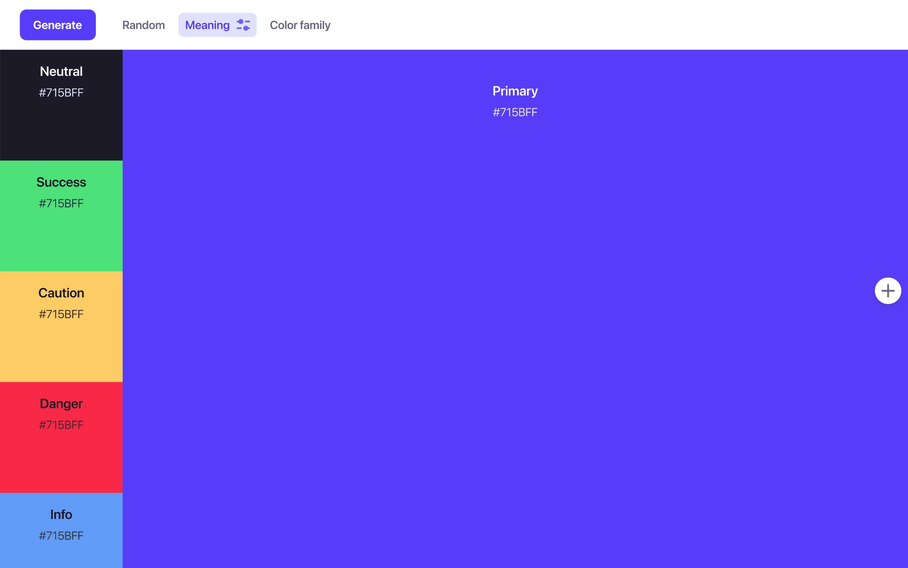
But a direction is not a palette. Once you know your primary color, Atmos generates the complementary accents, the neutral grays, and the success, warning, and danger colors around it, with one click, and keeps every piece editable as your product evolves.
Generate a full palette in AtmosEvery color needs a scale behind it
Interfaces consume colors in scales: a light tint for a hover background, a mid-tone for a border, a dark shade for text. Atmos generates these scales in OKLCH, a perceptually uniform color space, with easing curves and hue transitions that keep every step consistent and vibrant.
Contrast values update live as you tune the scale, so accessibility is checked while you design rather than audited afterwards.
Explore the shade generatorA palette that reaches your codebase
The palette only matters once it ships. Atmos exports to the formats product teams actually use: CSS custom properties, Tailwind CSS config, Style Dictionary tokens, JavaScript, and SVG swatches. The Atmos Figma plugin keeps your design files in sync with the same source of truth.
When is Khroma the better choice?
If you want serendipity, Khroma delivers it: train it on your taste and let it surprise you with pairings, gradients, and type samples all day, for free. It is a great mood-setting tool at the very start of a brand or side project.
When the exploration settles into "this is the color", Atmos takes over: building the system, checking accessibility, and exporting it to your team. The two tools genuinely complement each other.
What are designers saying?

Alex
@MetalHaze
Well, this is awesome!

Hennie
@andyhennie
I was convinced after this read. Their product is actually pretty neat.

SHOWROCK
@shonibareroqeeb
Since I’m not designing today, I have decided to share this simple powerful tool to make uniform color palette with clear accessible checks? Trust me, this will help you in your design system

Matthias Ott
@matthiasott.com
Just bought a lifetime license for Atmos because it is just sooo good for creating perceptually uniform color palettes – including a shade generator, a contrast checker, OKLCH support, CSS export, a Figma plugin, online sharing, and, and… 😍 👉 atmos.style (No affiliation, just genuine excitement! 😁)

Patrick Johansen
@patrickskov
another amazing tool for creating color scales in LCH.

Alberto Calvo
@intemperie.me
My new favorite is atmos.style, which works exactly as I expect, with access to OKLCH color space, P3 color gamut, and visual controls with curves and all the stuff you'd need to create something nice! 💖

Satori Graphics®
@satorigraphic2k
Love your tool and happy to spread awareness 👍🏻

jeremyelder
@jeremyelder
I like working in @atmos_style. Adding all of the variables and quickly selecting a swatch to key off of for contrast is fast.

Abhijeet
@iabhi1610
@atmos_style Best so far

Dusty Pomerleau
@dpom.bsky.social
hue-shifting on atmos is like a drug :)
Khroma alternative FAQ
Yes. Copy the hex values of the Khroma colors you like and paste them into Atmos. Atmos will build full shade scales, neutrals, and semantic colors around them.
Atmos uses color science rather than a personalized neural network. It generates brand and complementary status colors with one click, and builds perceptually uniform shade scales in OKLCH, so results are consistent, explainable, and easy to fine-tune.
Atmos offers a 14-day free trial with access to all features, and you can try limited demos of the tools directly on the atmos.style website. See the Atmos pricing page for plan details.
Khroma is an AI inspiration tool that generates color pairings based on your taste. Atmos is a complete toolbox for UI palettes: palette generation, OKLCH shade scales, WCAG 2 and APCA contrast checking, a color vision simulator, version history, and export to CSS, Tailwind, Style Dictionary, and Figma.
Yes. Atmos includes a contrast checker supporting WCAG 2 and APCA (the model behind WCAG 3), and a vision simulator that previews your palette under different types of color blindness.