Color Hunt alternative
A Color Hunt alternative that goes beyond inspiration
Color Hunt is a beautiful stream of curated palettes. Atmos is where a palette becomes a color system: editable, accessible, and exportable to your design files and code.
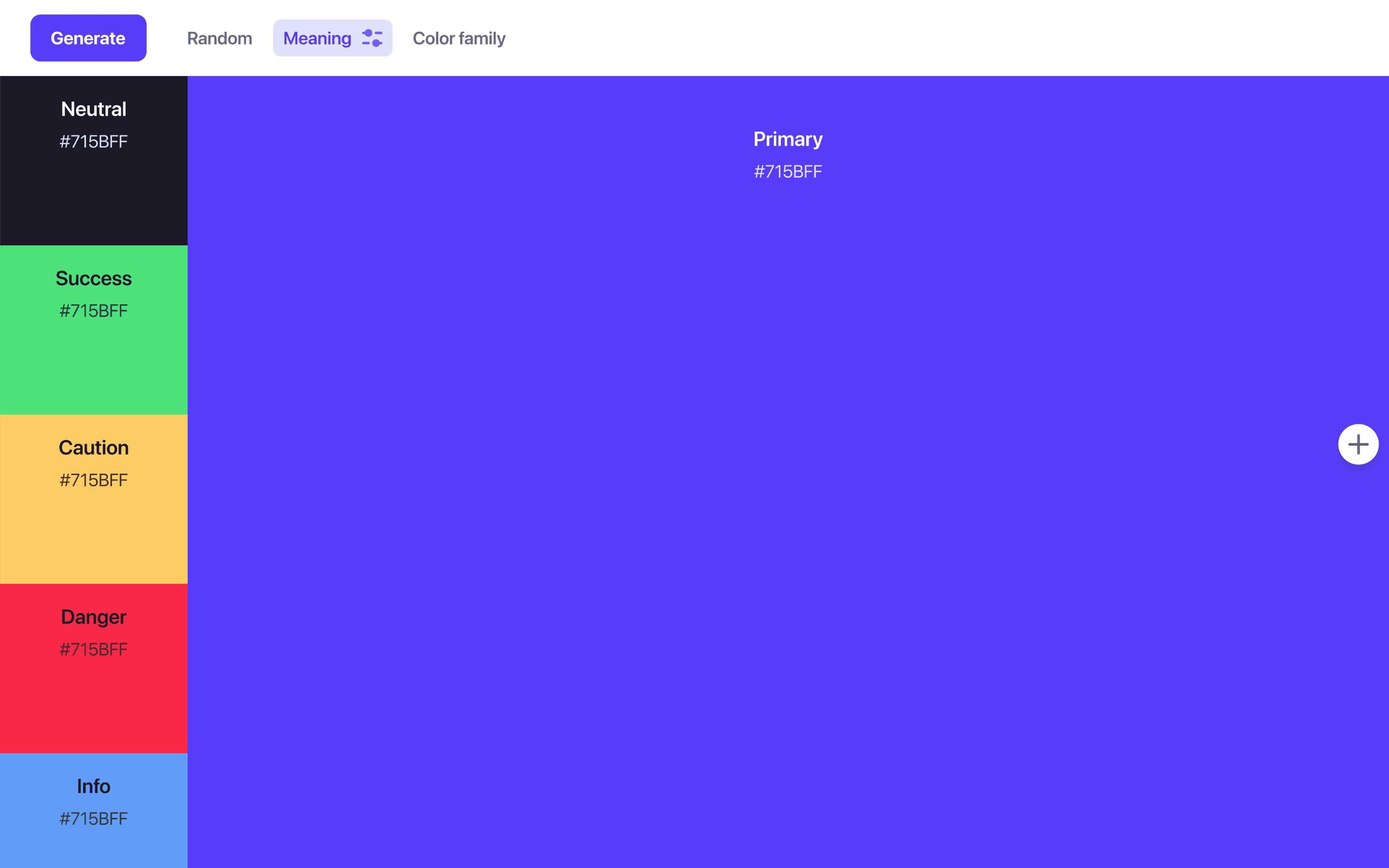
Helping 30,000+ world’s greatest designers create beautiful designs.
Why designers switch from Color Hunt to Atmos
Scrolling trending palettes is a great way to find a direction. Shipping that direction into a product takes tools Color Hunt was never meant to have.
Atmos vs Color Hunt at a glance
| Feature | Atmos | Color Hunt |
|---|---|---|
| Built for UI palettes & design systems | ||
| Pre-made palettes | Palette templates | Community palettes |
| Palette editing & fine-tuning | ||
| Shade scale generation (OKLCH) | ||
| Semantic status colors | ||
| Contrast checking (WCAG 2 & APCA) | ||
| Color vision simulator | ||
| Figma plugin | ||
| Export to code (CSS, Tailwind, Style Dictionary) | ||
| Free to try | 14-day trial + web demos | Free |
Other differences
Inspiration you can actually edit
Color Hunt palettes are fixed: you can like them and copy them, but not change them. Real projects always need adjustments, a brand blue that is slightly off, a background that needs to be warmer, a contrast fix for small text.
In Atmos, every color is editable in a perceptually uniform color space, and every edit ripples through your shade scales while contrast values update live. If you prefer starting from something pre-made, Atmos also offers free palette templates you can import and make your own.
Browse Atmos palette templatesA palette becomes a system
The gap between a pretty palette and a usable UI palette is structure: shade scales for each color, neutral grays for text and surfaces, and semantic colors for success, warning, and danger states.
Atmos generates that structure automatically. Paste the hex codes of a palette you found, and Atmos builds perceptually uniform OKLCH scales with easing curves around them, ready for buttons, cards, and dark mode.
Try the shade generatorAccessibility is part of the picture
Trending palettes are optimized for how they look in a swatch, not for how they read as text on a background. Atmos includes a contrast checker supporting WCAG 2 and APCA, plus a vision simulator that shows your palette through different types of color blindness, so surprises surface before launch, not after.
Check contrast in AtmosWhen is Color Hunt the better choice?
For pure browsing, Color Hunt is delightful: a fast, free, endless feed of community-curated palettes organized by trends and moods. It is perfect for moodboards, illustrations, presentations, and those moments when you just need a spark.
When the spark needs to become a product palette, with shades, accessibility, and tokens, that is Atmos territory. A popular workflow: find a palette you love on Color Hunt, paste its hex codes into Atmos, and build the real system from there.
What are designers saying?

Alex
@MetalHaze
Well, this is awesome!

Hennie
@andyhennie
I was convinced after this read. Their product is actually pretty neat.

SHOWROCK
@shonibareroqeeb
Since I’m not designing today, I have decided to share this simple powerful tool to make uniform color palette with clear accessible checks? Trust me, this will help you in your design system

Matthias Ott
@matthiasott.com
Just bought a lifetime license for Atmos because it is just sooo good for creating perceptually uniform color palettes – including a shade generator, a contrast checker, OKLCH support, CSS export, a Figma plugin, online sharing, and, and… 😍 👉 atmos.style (No affiliation, just genuine excitement! 😁)

Patrick Johansen
@patrickskov
another amazing tool for creating color scales in LCH.

Alberto Calvo
@intemperie.me
My new favorite is atmos.style, which works exactly as I expect, with access to OKLCH color space, P3 color gamut, and visual controls with curves and all the stuff you'd need to create something nice! 💖

Satori Graphics®
@satorigraphic2k
Love your tool and happy to spread awareness 👍🏻

jeremyelder
@jeremyelder
I like working in @atmos_style. Adding all of the variables and quickly selecting a swatch to key off of for contrast is fast.

Abhijeet
@iabhi1610
@atmos_style Best so far

Dusty Pomerleau
@dpom.bsky.social
hue-shifting on atmos is like a drug :)
Color Hunt alternative FAQ
Yes. Copy the four hex codes from any Color Hunt palette and paste them into Atmos. Atmos will generate full shade scales, neutral grays, and semantic status colors around them.
Yes. Atmos offers free palette templates designed for UI work that you can import into the app and customize, shade by shade.
Atmos offers a 14-day free trial with access to all features, and you can try limited demos of the tools directly on the atmos.style website. See the Atmos pricing page for plan details.
Color Hunt is a curated gallery for discovering palettes. Atmos is a toolbox for creating and refining UI palettes: it generates shade scales in OKLCH, checks contrast with WCAG 2 and APCA, simulates color blindness, tracks version history, and exports to CSS, Tailwind, Style Dictionary, and Figma.
No. Atmos generates a professional palette structure from a single primary color, so beginners get a solid system out of the box while experienced designers can fine-tune every curve and step.