LCH vs OKLCH: what is the difference?
Learn the differences between LCH and OKLCH color spaces for UI design. Understand chroma, hue behavior, and why OKLCH is the better choice for CSS color palettes.

Vojtech Vidra, Ondrej Pesicka • May 7, 2023 • Updated May 7, 2023
If you've recently come across the LCH and OKLCH CSS colors and are curious what's that all about, you're in the right place. In this article, we'll explore the differences between LCH and OKLCH and shed light on why these color spaces are ideal for UI design and color palettes.
New to LCH? Our deep-dive into LCH color space covers the fundamentals before you compare the two.
What is LCH and OKLCH
LCH and OKLCH are both color models built on top of LAB and OKLAB color spaces, respectively. These color spaces are now available in modern web browsers. What sets these color spaces apart is their notation. Rather than using random numbers and letters (like #573CFA) you write numbers that actually make sense. For instance, lch(40% 106 300) is much easier to understand since there are three human-friendly channels: Lightness, Chroma, and Hue.

LCH vs OKLCH
LCH was introduced by the International Commission on Illumination (CIE) in 1976 with the main goal of modeling colors in a three-dimensional space as close to human perception as possible.
The outcome is that when multiple hues with the same lightness and chroma are placed next to each other, they tend to blend seamlessly.

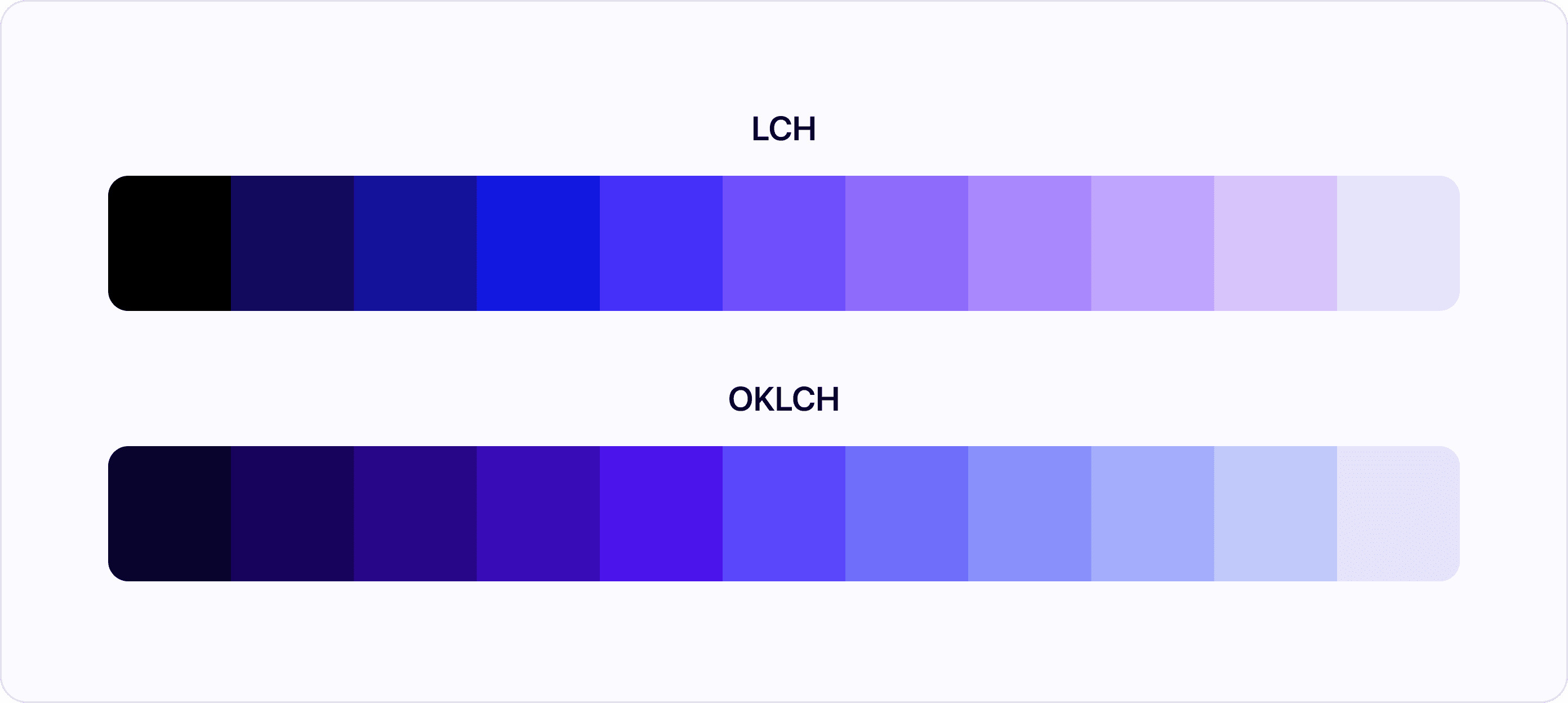
OKLCH, on the other hand, was developed in 2020 to address the issues of LCH. As it turned out, the LCH color space has an undesirable hue shift from blue to purple when changing just the lightness value. This issue becomes a problem when using LCH for creating shades from the same color family.
Now that we've covered the major differences, let's explore each color channel individually.
Lightness in LCH vs OKLCH
In both color models, the lightness goes from 0% to 100%. However, in some cases, you may encounter OKLCH lightness defined on a scale of 0 to 1.
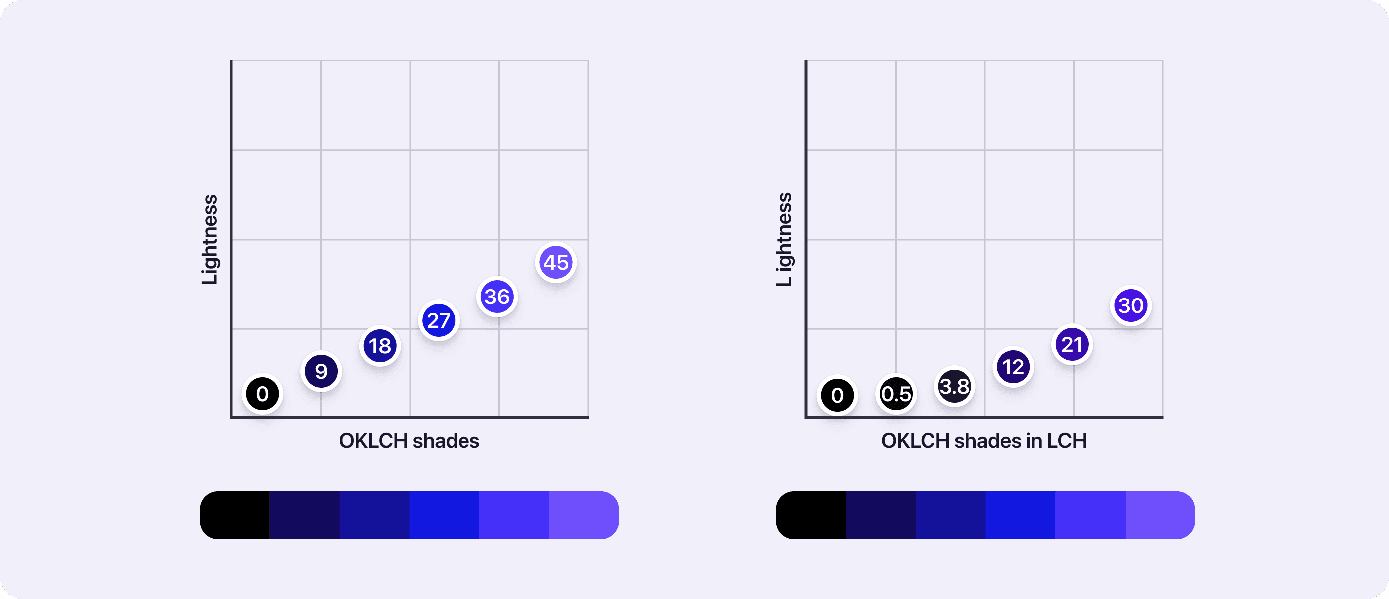
There’s also a big difference in the dark shades of both color spaces. An LCH lightness of 5 is roughly equivalent to an OKLCH lightness of 18. In other words, any shades in OKLCH with a lightness of 15 or less are very dark.

Chroma in LCH vs OKLCH
Chroma works very similarly, the only difference is that the available range. LCH chroma goes from 0 to approximately 150, it might be more or less, depending on the color gamut in use. OKLCH chroma goes from 0 to about 0.5, which also depends on the color gamut.
Hue in LCH vs OKLCH
Both color spaces use a hue range of 0 to 360. The main difference is the improved blue-purple hues. In the following example, you can see shades of the constant hue of 300. These shades also keep consistent chroma to really compare the differences just in the behavior of hue. As you can see, the OKLCH is a nice blue color across the whole spectrum. However, LCH is going from blue to purple-ish blue in darker shades.

OKLCH is better
There’s really no reason to use LCH over OKLCH. Since OKLCH doesn’t have any major drawbacks, it’s safe to say you can ditch LCH for OKLCH when you’re creating your next UI color palette.
OKLCH vs HSL
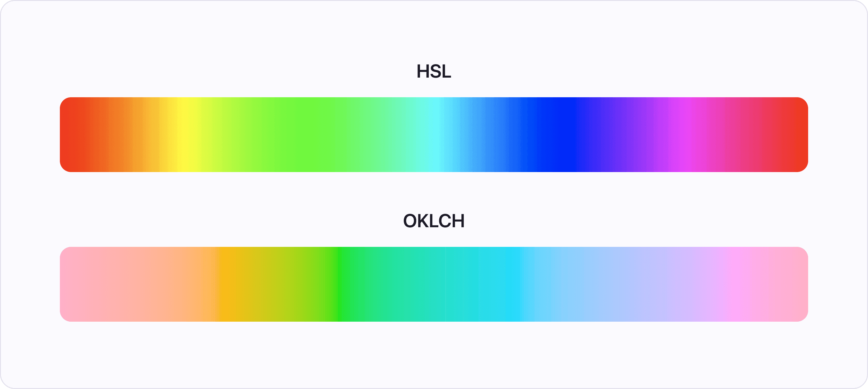
Maybe you’re wondering how OKLCH stacks up to HSL. The channels seem to work very similarly. The short answer is: OKLCH is better, I mean a lot better… The long answer can be found in our LCH is the best color space! article. The article is about LCH, but we’ve already discovered that LCH and OKLCH work in the same way and OKLCH is better.

Conclusion
If in doubt, use OKLCH. It has a couple of improvements over LCH and there’s no real drawback. When creating UI color palettes, you will really appreciate the benefits of OKLCH. Compared to HSL, both LCH and OKLCH are solid choices. HSL has a lot of shortcomings due to the limitations of sRGB color space it's based on.