LCH is the best color space!
LCH is a perceptually uniform color space ideal for UI design and color palettes. Learn how LCH outperforms HSL and why it matters for accessibility and consistency.
Vojtech Vidra, Ondrej Pesicka • April 15, 2022 • Updated February 18, 2026
LCH is a color space designed to represent colors in a way that is more similar to how the human eye perceives them. This quality, known as perceptual uniformity, makes LCH an excellent choice for creating accessible, consistent, and predictable color systems in design.
In this blog post, we will explore the details of LCH, compare it to the HSL color space, and discuss how it can benefit you in your design work.
What is LCH?
For the past few decades, we’ve been using sRGB color space on the Web. sRGB is limited to 16.7 million colors which might seem like a lot, but with the rapid evolution of displays, it is now common to have displays with more than 100% sRGB coverage. Additionally, sRGB was designed based on how displays work, rather than how our eyes perceive color. This makes it less than ideal for creating consistent and accessible color systems. That's where LCH comes in.
LCH color space, also known as HCL, CIELAB, LAB, CIELUV, or CIELCH is a color space that was first defined in 1976 by International Commission on Illumination (CIE), hence the name CIELAB. The CIE is the international authority on light, illumination, color, and color spaces. The main goal of LCH is to achieve perceptual uniformity, meaning that it behaves according to how our eyes perceive color. In theory, LCH can describe an infinite number of colors, but what is important for us is that its color gamut is larger than that of sRGB. This means that it can represent a wider range of colors, allowing for even more beautiful websites.
LCH stands for Lightness, Chroma, and Hue. At first glance, this might seem similar to HSL (Hue, Saturation, and Lightness), but these color spaces describe colors in different ways. Let's take a closer look at each component of LCH separately.
LCH Lightness vs HSL Lightness
Lightness describes the relative brightness of a color. However, each space goes about it differently.
- HSL lightness resembles the amount of black or white added to a pure color. For example, a light blue color can be created by adding white to a pure blue hue.
- LCH lightness describes the relative brightness of a color compared to a similarly illuminated white.
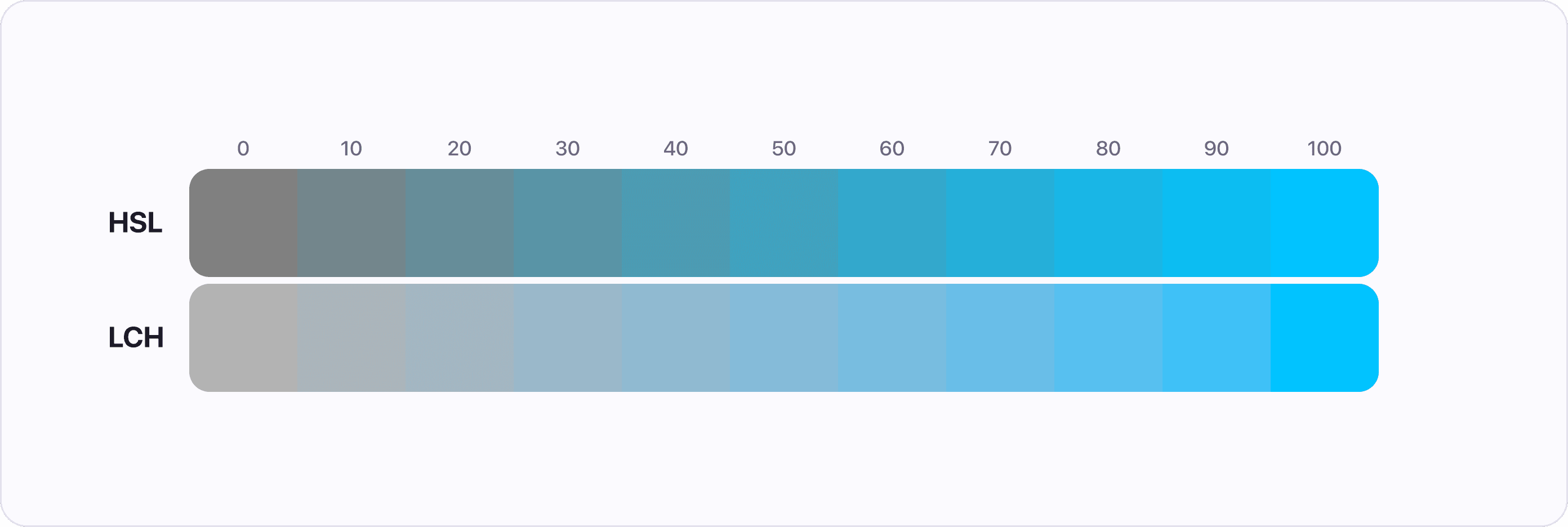
In the example below we see the same hue of Blue and Yellow represented in HSL and LCH. Each shade has maximum chroma or saturation and we are only changing the lightness value.
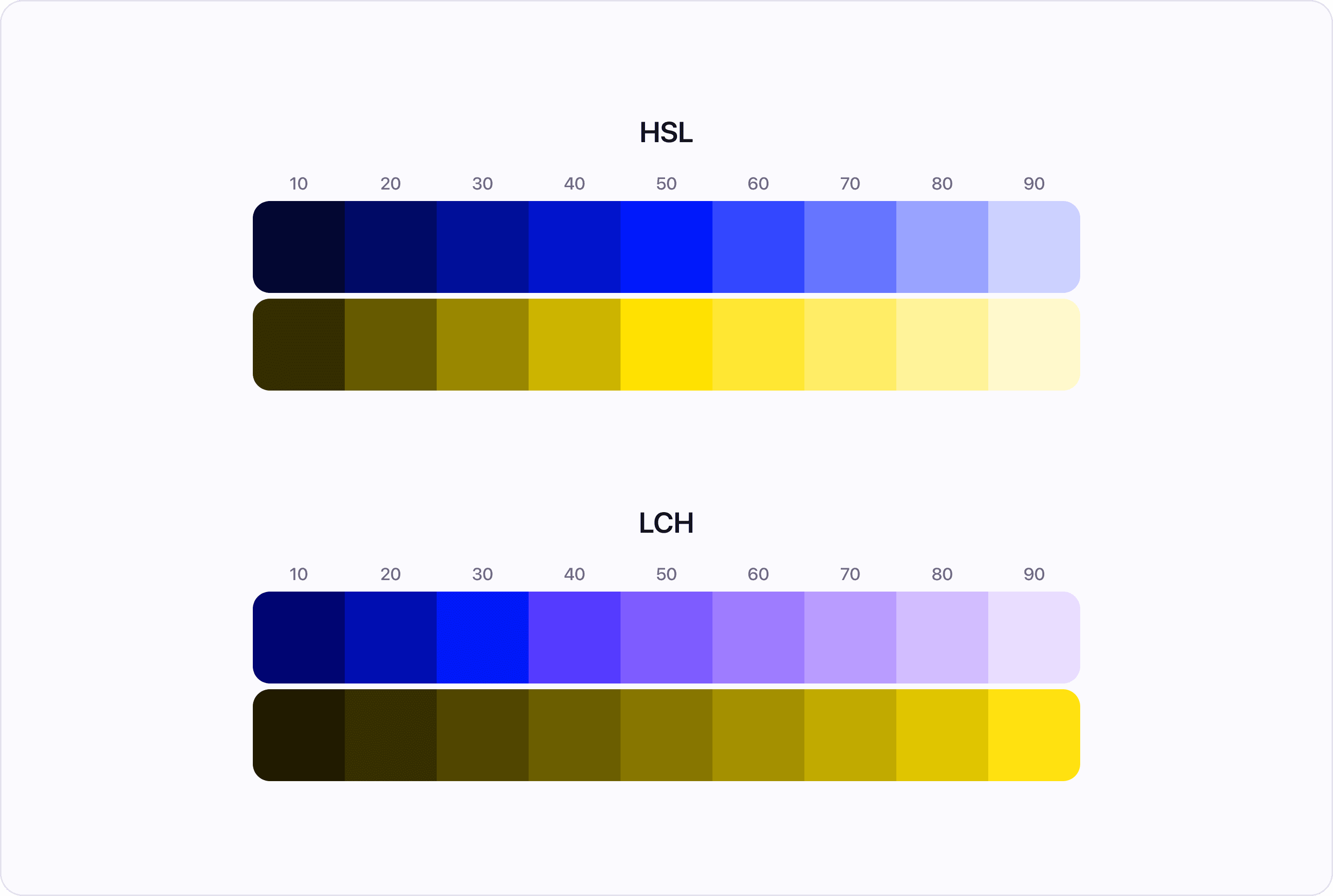
Notice how the HSL colors are the most vibrant and colorful with the lightness of 50. That's because there is no black or white mixed in, it's just the pure hue. This is a fundamentally incorrect way of describing the lightness of color because the yellow looks much lighter than the blue with the same HSL lightness value.
On the other hand in LCH both yellow and blue are gradually increasing in lightness and the yellow shades don't look any lighter than the blue ones.
LCH Chroma vs HSL Saturation
Comparing Chroma and Saturation is a bit tricky because they work in different ways. In general, however, these values describe the intensity or richness of a color.
- HSL saturation saturation has a fixed range from 0 (gray) to 100 (purest).
- LCH chroma has a range from 0 to approximately 131, although not all colors can reach this maximum value due to the limitations of our screens.
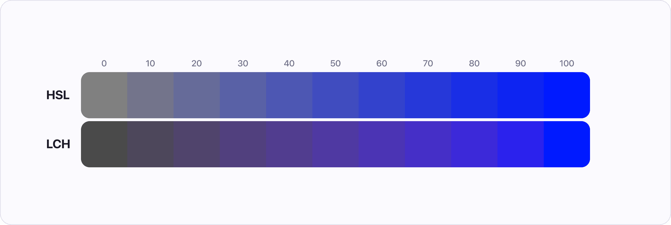
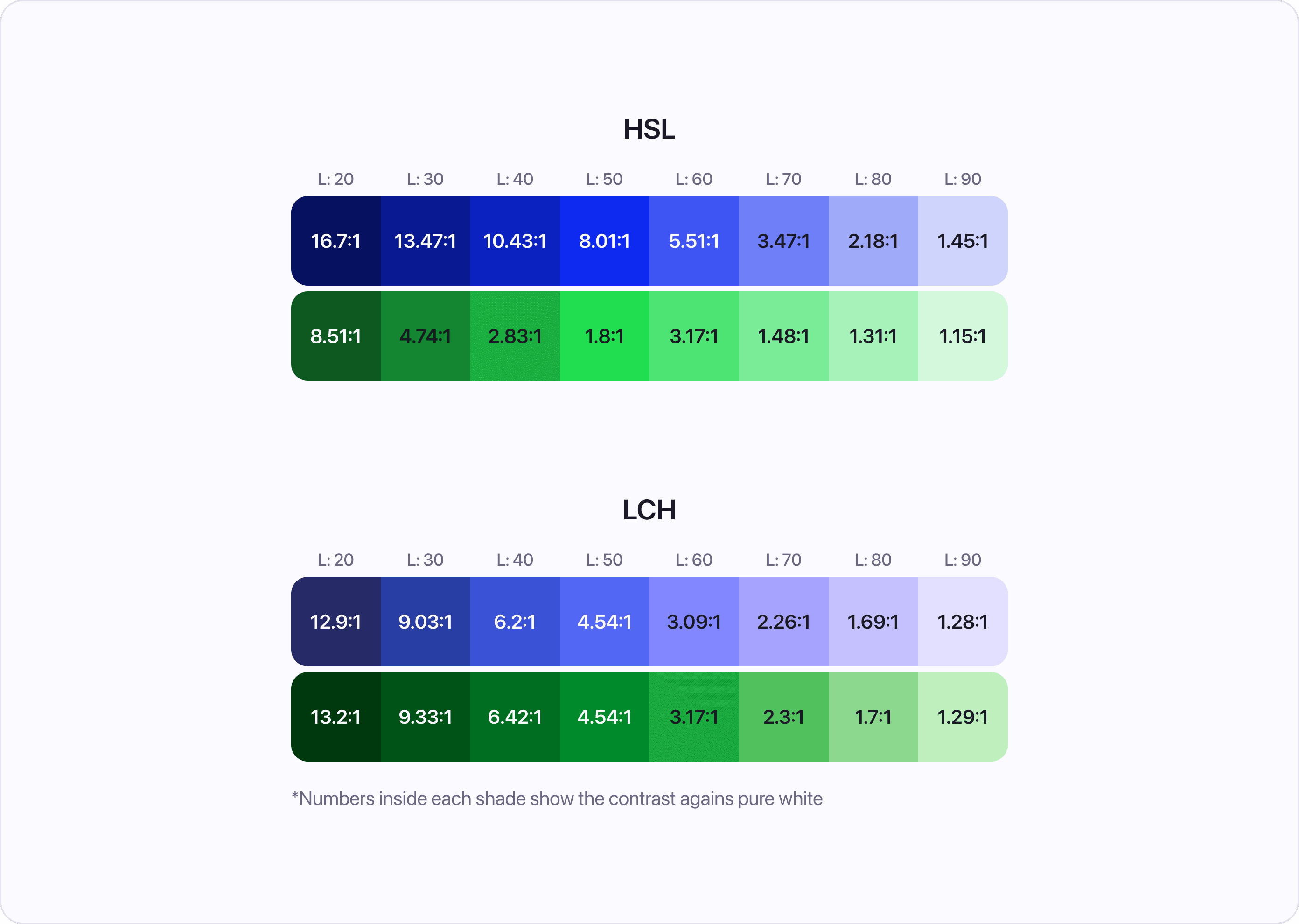
In the example below, we see the same hue of blue in LCH and HSL, with only the Saturation or Chroma value being changed in equal increments. Notice how the shades in LCH appear to blend together, while there are pronounced steps in HSL.
In this next example, we changed the hue to a light blue color. As before, you can see that the shades in LCH appear to blend together, while there are pronounced steps in HSL.
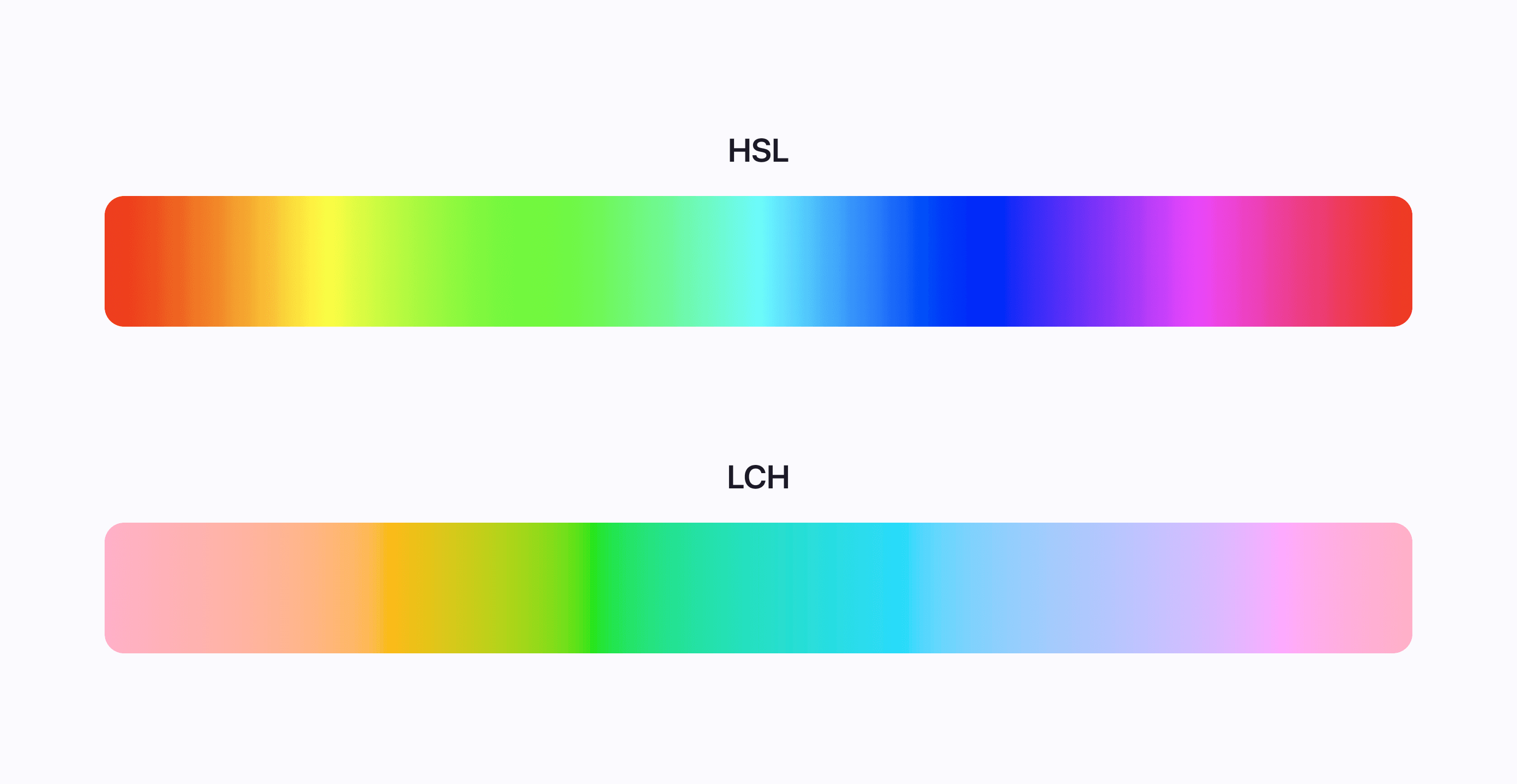
LCH Hue vs HSL Hue
Hue is similar in both LCH and HSL color spaces. The color spectrum starts at red and progresses through green, blue, and back to red. The only difference is that the hues in LCH are slightly shifted compared to those in HSL. As you can see in the example below, the hue value of 0 in HSL is pure red, while in LCH it is a pinkish red.
The example also illustrates the perceptual uniformity of LCH: all colors have the same lightness and saturation, with only the hue changing. As a result, the colors in LCH appear to blend together, while in HSL they are vastly different.
History of choosing colors for UI
In the early 2000s, it was common to choose colors for websites using only HEX or RGB values. At the time, there were few tools available for selecting colors, and HSL was not widely used. If you needed an orange color, for example, you would simply combine red and green and call it a day.
This blind way of picking colors was soon replaced by more sophisticated tools like Photoshop, which made it easier to pick colors accurately. Today, many designers still use the same color tools in popular design software like Figma or Sketch, and HSL has become the gold standard due to its ease of use.
Recently a lot of shade generators and palette generators started popping up. These tools are often more advanced than simply adjusting the HSL lightness value across a set of shades. However, they often lack flexibility and customization options.
This is where LCH comes in. It is the best way to create uniform, accessible, and predictable UI color palettes. While it may take some time, we believe that designers will eventually abandon HSL due to its inconsistencies and switch to LCH or a similar color space.
For more information on the benefits of LCH, check out this great post by Stripe (the payment platform) on how they made their color palette accessible.
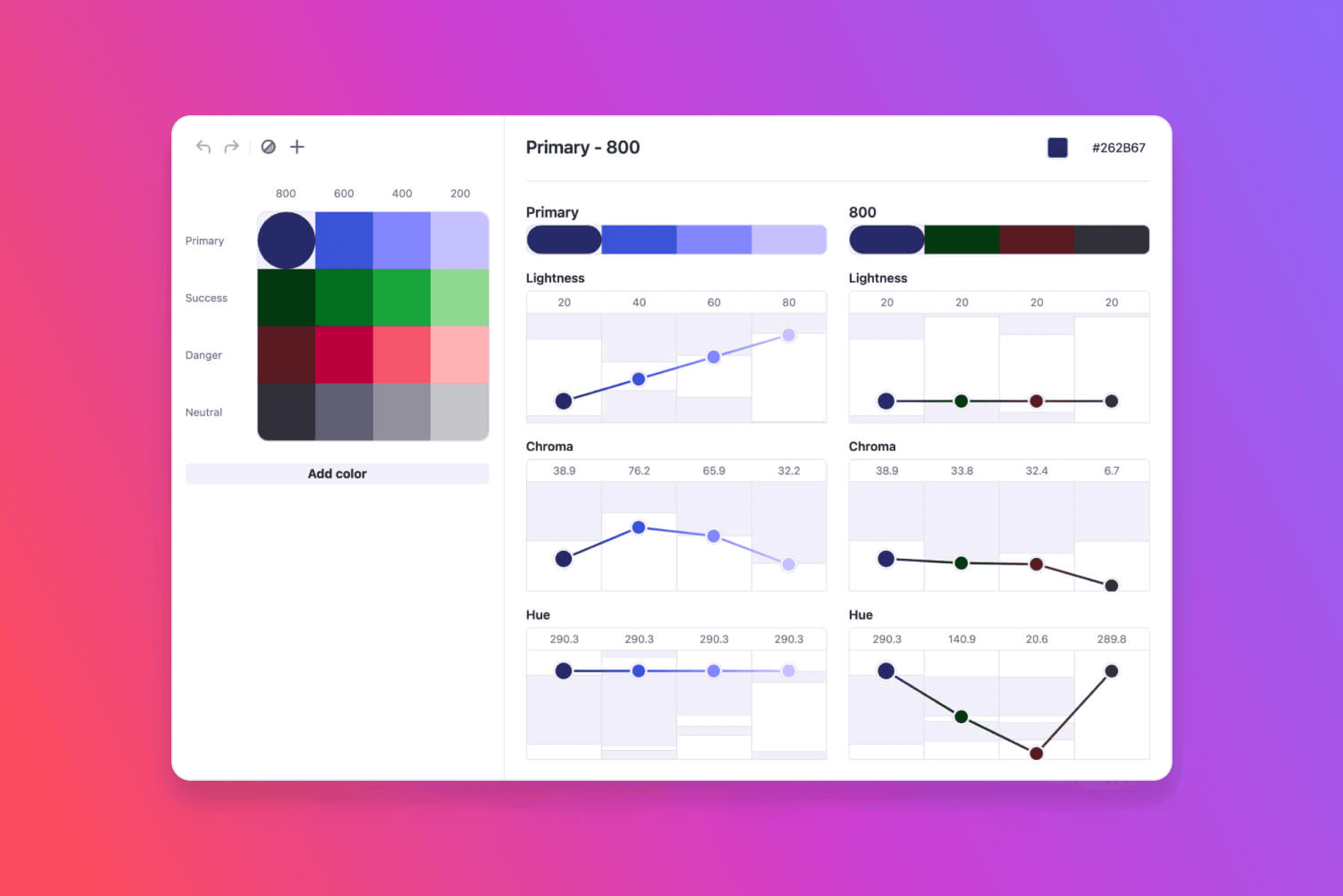
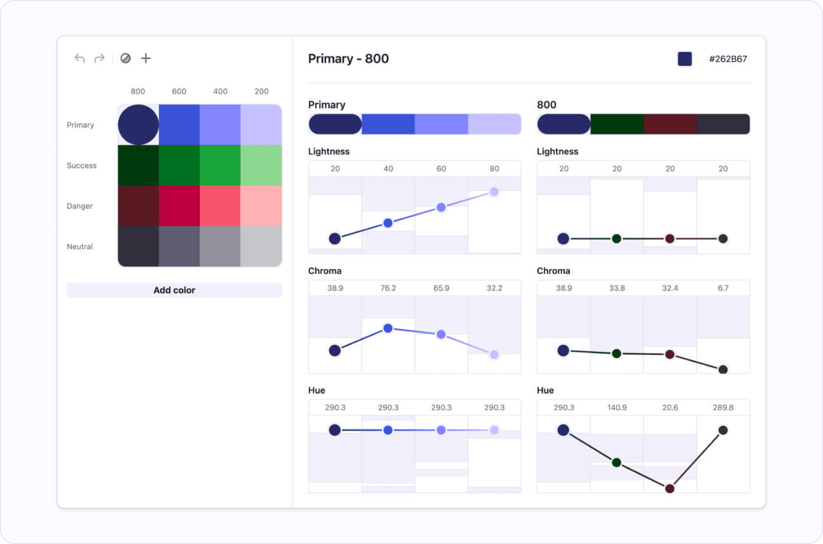
The easiest way to start experimenting with LCH is to use Atmos. We created Atmos to offer the benefits of LCH to everyone from hobbyist developers to professional designers who need to create a color palette for their design system.
LCH makes UI design a breeze
Thanks to the properties of LCH color space, several aspects of UI design are much easier to do. These include:
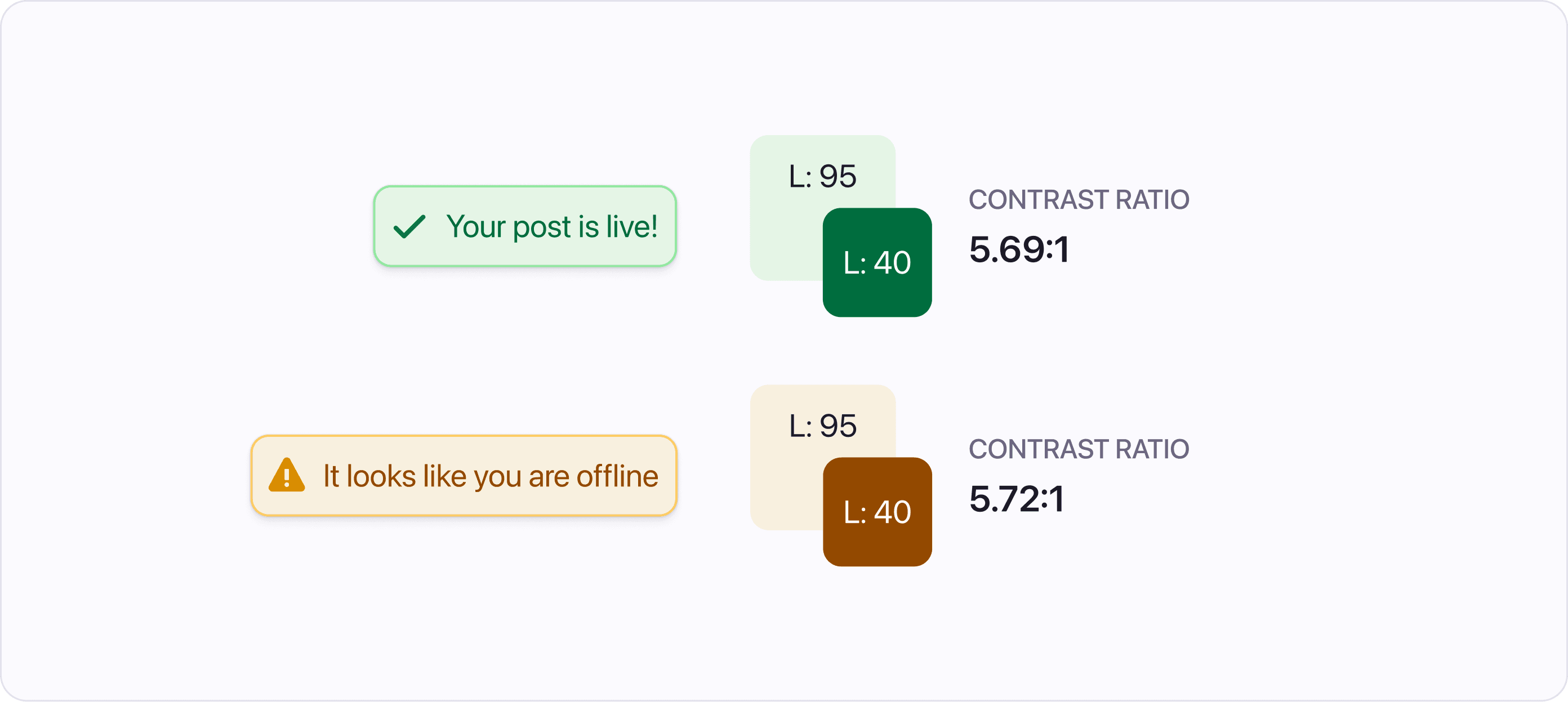
Built-in accessibility through consistent contrast
If you have experience working with HSL, you may have noticed that two different colors with the same lightness can have vastly different contrast ratios. In contrast, LCH ensures that different colors with the same lightness have almost identical contrast ratios, making it easier to ensure accessibility.
Interchangeable colors
The perceptual uniformity of LCH allows you to easily swap colors without affecting the contrast ratios. This can be useful for experimenting with different color combinations in your UI.
Flexible palette
Adding colors or shades to your palette in LCH is simple. There is no need to remember how you've created the palette. If you match the lightness and saturation levels of other colors you can be sure that the new color will have the same contrast ratio and will be perceptually uniform.
HSL is dead - Long live LCH
As you may have guessed, we LOVE the LCH color space. In our opinion, it is currently the best color space for creating UI color palettes. However, one potential disadvantage of LCH is that it is not yet widely supported in popular design tools, on the web, or in mobile apps. But the ability to easily convert colors from LCH to HEX (or RGB) is a small tradeoff for all the benefits of using LCH.
LCH Playground for everyone
To help you explore LCH and experiment with UI color palettes, we have created Atmos. It is designed for anyone interested in using LCH, from hobbyist developers to professional designers. We encourage you to try Atmos and see for yourself how LCH can improve your design work.