Designing for Color Blindness in UI Design
Learn best practices for designing accessible UI for users with color blindness. Covers all types of color blindness, high contrast design, and testing tools.
Ondrej Pesicka • February 4, 2023 • Updated July 20, 2023
As the world becomes more and more dependent on technology, it's crucial to ensure that all users, including those with color blindness, have a positive experience while using your products. You as a UI designer can have a significant role in making this happen by designing interfaces that are accessible to everyone, regardless of their visual abilities. In this article, we will explore the importance of designing for color blindness in UI design and provide tips on how to create accessible interfaces.
What is Color Blindness?
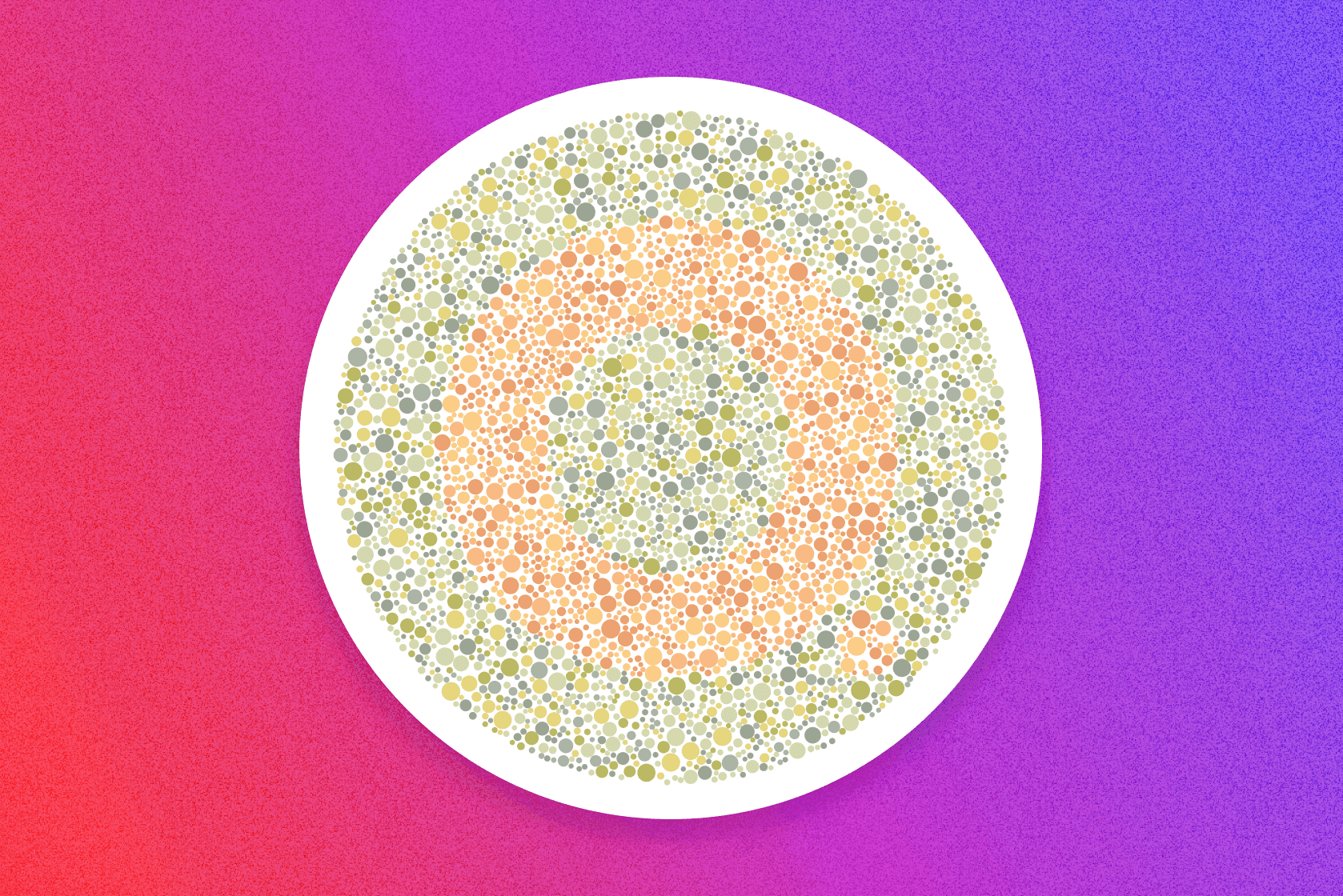
Color blindness is a vision deficiency where a person is unable to distinguish between certain colors. There are three main types of color blindness: red-green, blue-yellow, and total color blindness.
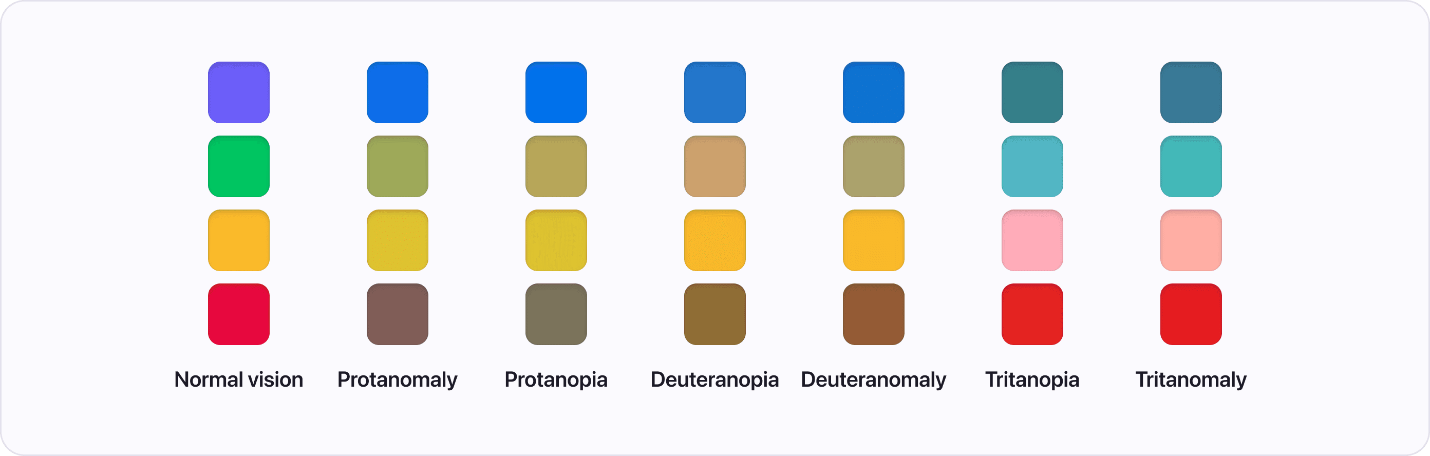
Red-Green Color Blindness
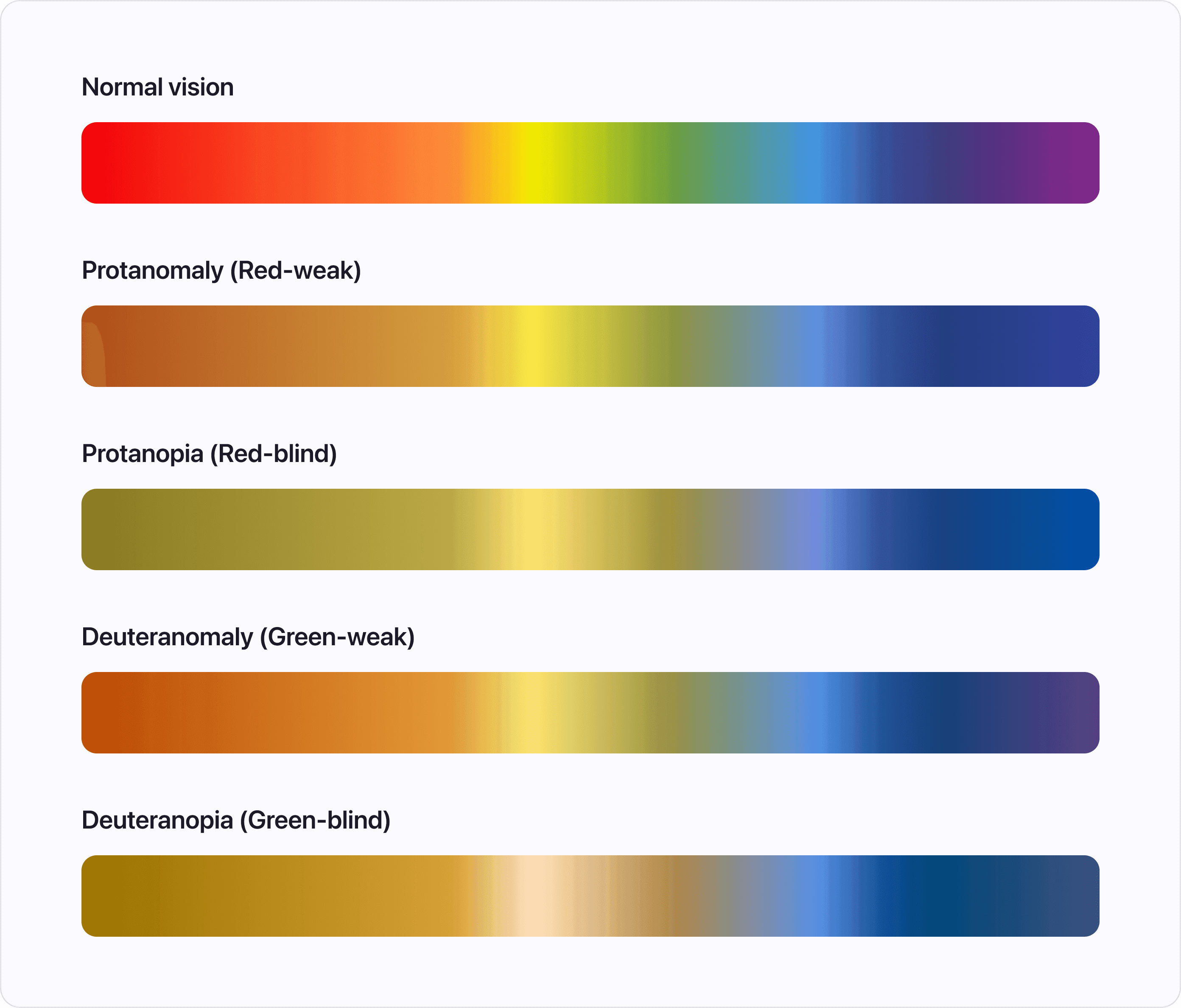
The most common type of color blindness is red-green color blindness, which affects approximately 7% of men and 0.5% of women. People with red-green color blindness have difficulty differentiating between red and green hues.
There are four types of red-green color blindness based on how much of each color people can see:
- Protanomaly (Red-weak) - some red color is visible, while green and blue are normal.
- Protanopia (Red-blind) - can't see any red color.
- Deuteranomaly (Green-weak) - some green color is visible, while red and blue are normal.
- Deuteranopia (Green-blind) - can't see any green color.
Blue-Yellow Color Blindness
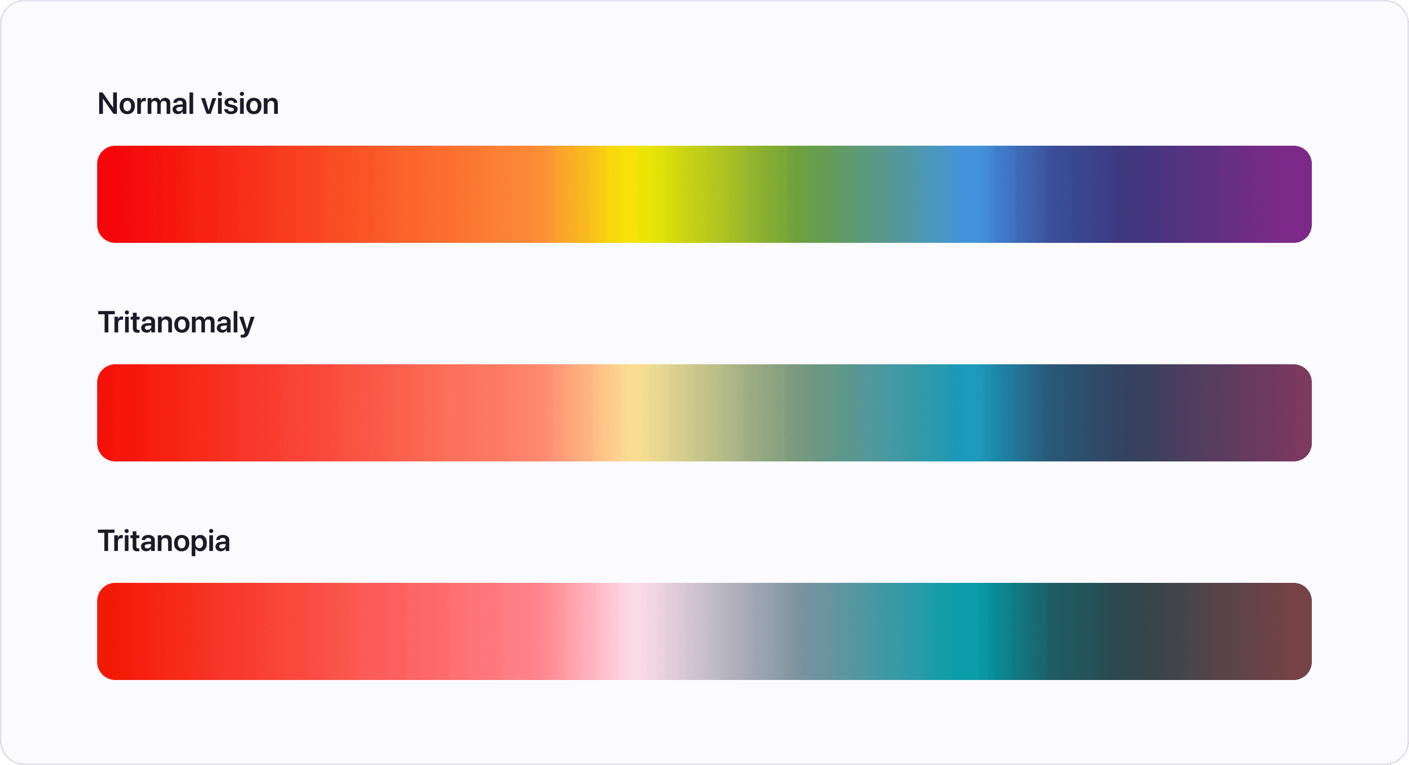
Blue-yellow color blindness is less common, affecting approximately 1% of men and 0.01% of women. People with blue-yellow color blindness have difficulty differentiating between blue and yellow hues.
There are two types of blue-yellow color blindness based on how much of each color people can see:
- Tritanomaly - difficulty distinguishing between blue and green, and between yellow and red.
- Tritanopia - difficulty distinguishing colors containing blue or yellow (for example, green and blue or purple and red).
Total Color Blindness
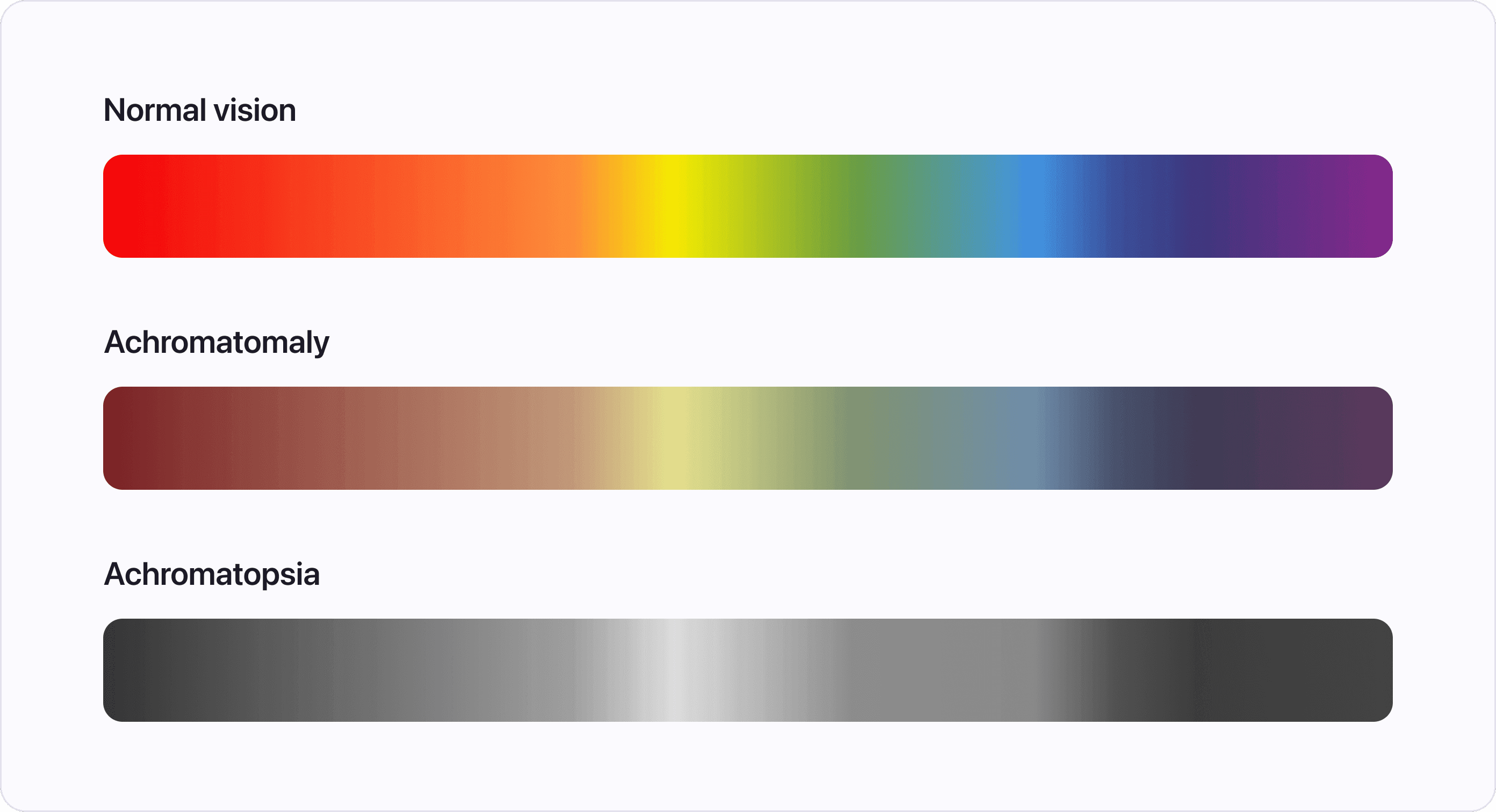
Total color blindness is the rarest form of color blindness and affects only a small percentage of the population. People with total color blindness can only see in shades of gray and have difficulty differentiating between any colors.
The Importance of Designing for Color Blindness
Designing for color blindness is essential for several reasons. Firstly, it ensures that all users have equal access to information. Secondly, it helps to prevent confusion and possible misinterpretation of information, especially in cases where colors are used to convey information. Finally, designing for color blindness is a sign of inclusivity and demonstrates your or the company's commitment to creating accessible products for anyone.
Designing for Color Blindness in UI Design
Designing UI with color blindness in mind can have positive effect even for users without any visual deficiencies. Here are a few tips on how to design accessible interfaces:
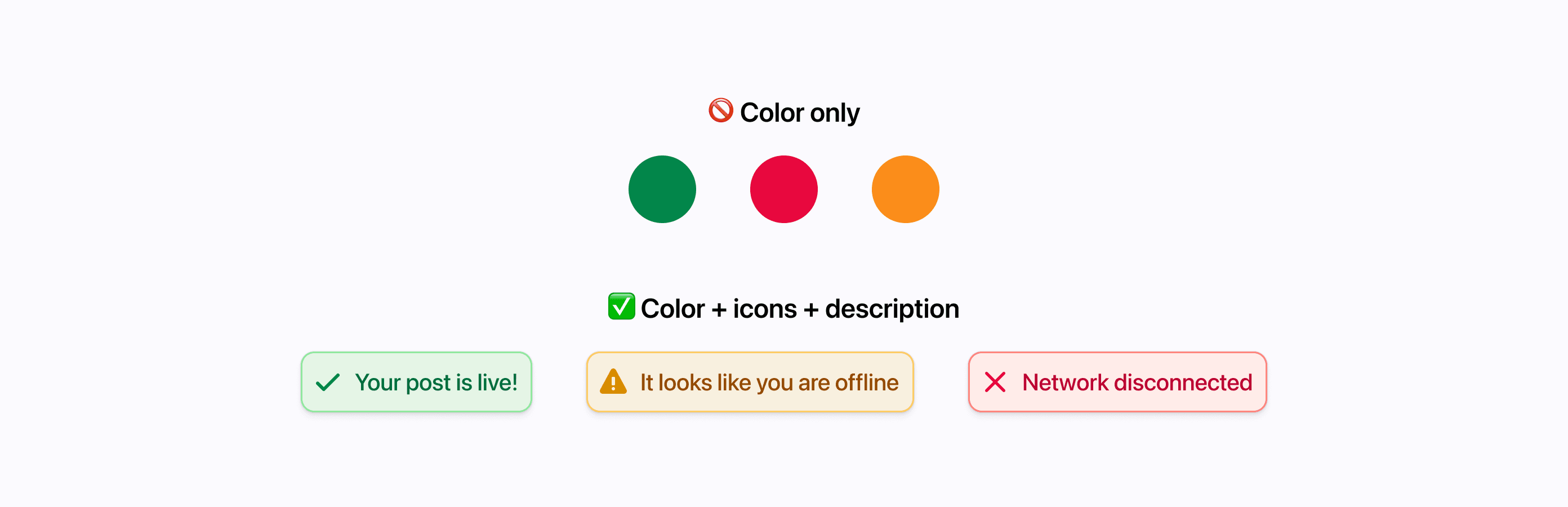
1. Avoid Using Color as the Only Means of Conveying Information
When designing interfaces, it's crucial to avoid using color as the only means of conveying important information. For example, instead of using a red circle to indicate a warning, use an exclamation mark alongside it. This is a good practice to follow even when you are not focussing on color blindness, since it can remove ambiguity.

2. Use High Contrast Color Schemes
Using high contrast color schemes can make it easier for people with color blindness to distinguish between different elements on the screen. It's essential to choose colors that have enough contrast to ensure that all users can see and understand the information presented.
3. Test Your Design with Color Blindness Simulators
It's important to test your design to ensure that it's accessible to people with color blindness. There are several tools available that allow you to do that. This can help you identify any issues with your design and make the necessary changes. Here are our favorite tools:
- Atmos - here at Atmos we provide tools for designers to create accessible color palettes, with tools like color contrast checker and vision simulator you can create the perfect palette in minutes.
- Stark - standalone Mac app or a plugin for Figma
- Chrome DevTools - allows you to simulate color blindness in your browser
- Let's get color blind - Chrome or Firefox extensions for simulating various deficiencies
4. Provide Alternative Text Descriptions for Color-Dependent Content
Similar to the first point, alternative text descriptions can provide additional information for users with color blindness. For example, instead of using just a green checkmark to indicate that a task has been completed, use the text "Task Completed" alongside it. Again, this is a good practice even for regular users as it can clear up the meaning.
Conclusion
In conclusion, designing for color blindness is an important part when creating accessible UI. By understanding the different types of color blindness, using high contrast colors, avoiding conveying information only by colors, and testing your designs, you can create UI that has a positive user experience for all. Remember, designing for color blindness is just one part of creating a great UI color palette, so make sure to consider other accessibility considerations as well.