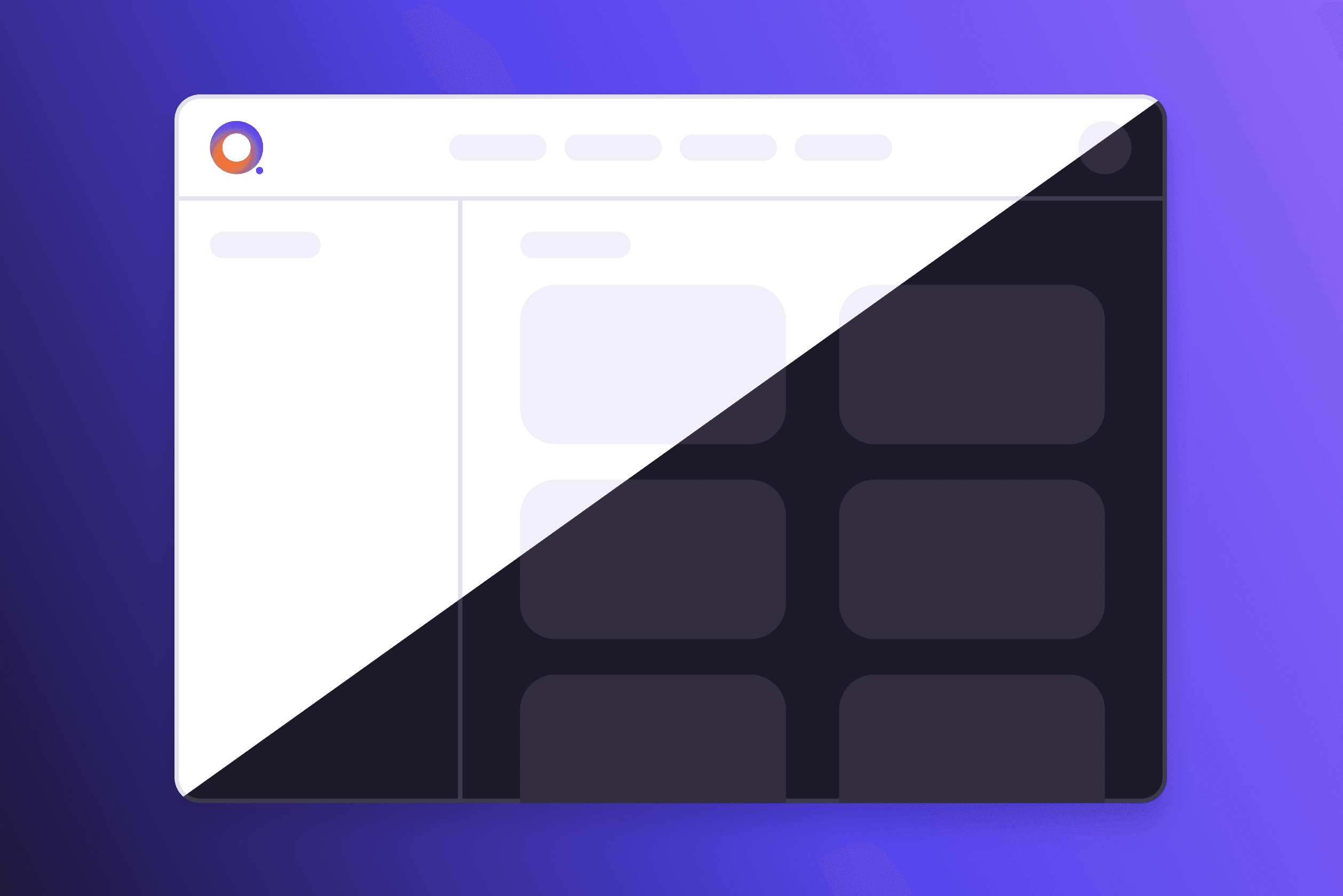
Dark mode UI design – 7 best practices
Dark mode is one of the most requested UI features. Learn 7 best practices for designing accessible, polished dark themes, from color saturation to focus indicators.
Ondrej Pesicka • October 8, 2022 • Updated July 20, 2023
Dark Mode has swallowed the world. It's probably the most requested feature in any app or website, and every designer's passion project. Let's dive deep into its benefits, disadvantages, and what you should consider when creating a dark theme.
Pros and Cons of Dark Theme
A dark theme has real benefits (and some disadvantages) that make it a viable feature to consider adding to your UI. Let's look at a few of them closely.
Pro: Reduced eye strain
Dark themes can reduce eye strain, especially when in a dark environment. But when used in bright environments, it can have the opposite effect. To avoid straining the eyes of your users, offer an easy way of switching modes or an even better option - to sync with the system theme.
Pro: Energy savings
Another benefit of dark mode is that it can reduce battery usage. Users with OLED screens can enjoy the ability to turn off black pixels and save energy. You don't even need to use pure black, dark grays also enjoy decreased power usage. For example, Google's recommended surface color #121212 uses just 0.3% more power than pure black.
Con: Motion blur
Dark theme can create issues with motion blur for users with OLED displays. When the UI is moving around, the LEDs are turning on and off, which causes motion blur. This is mostly an issue when using pure black with a lot of movement.
Con: Decreased reading comprehension and speed
Some companies claim that Dark mode can also increase focus and productivity. However, several studies have found that people have better reading comprehension when reading text with positive polarity (dark text on light background). Find out more in this study on pupil size and proofreading performance or another one about how color combinations affect reading speed.
7 best practices for Dark Theme
When creating your dark mode palette, a lot of the principles for light mode apply. But there are some dark theme-specific things to consider.
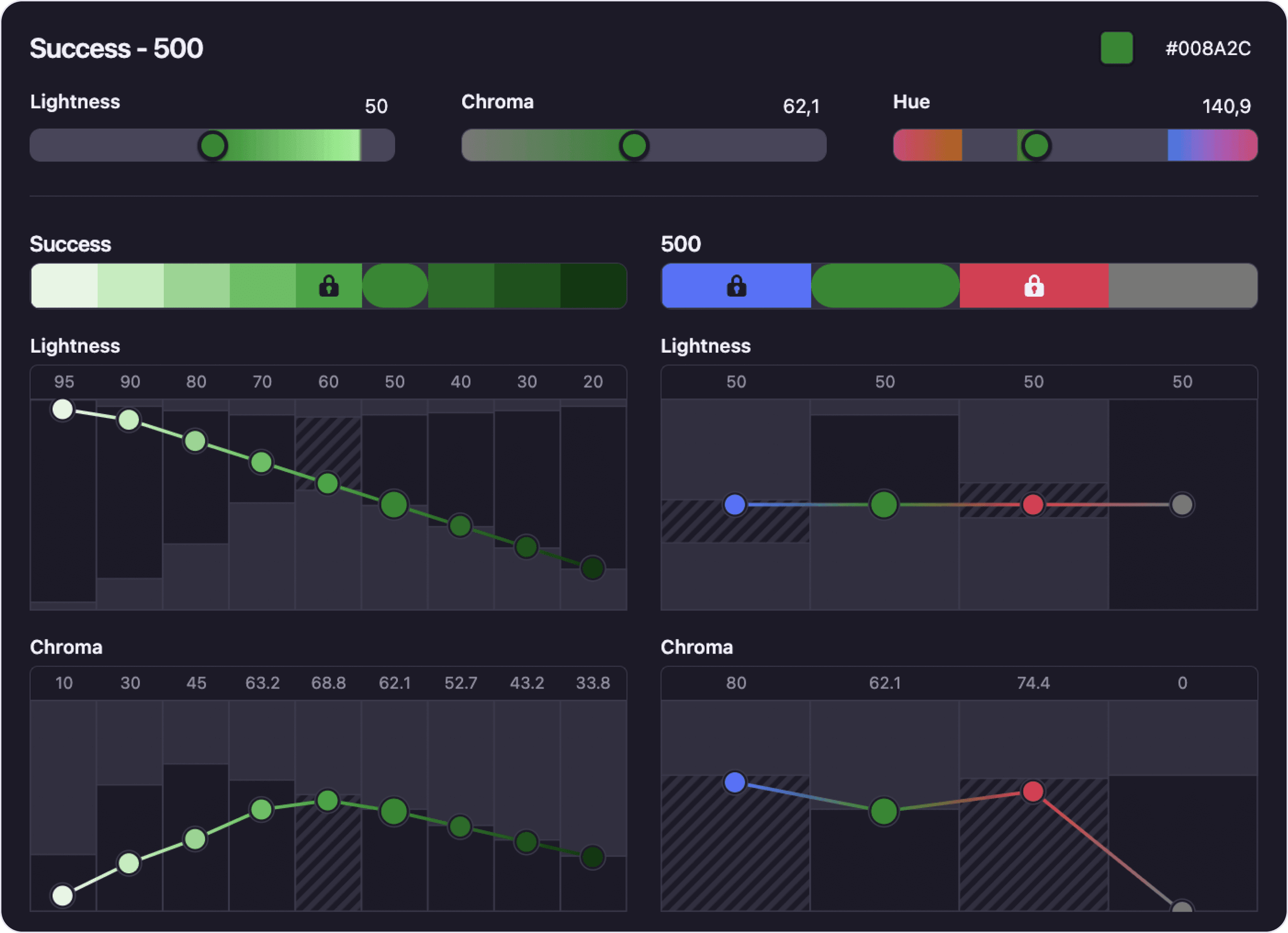
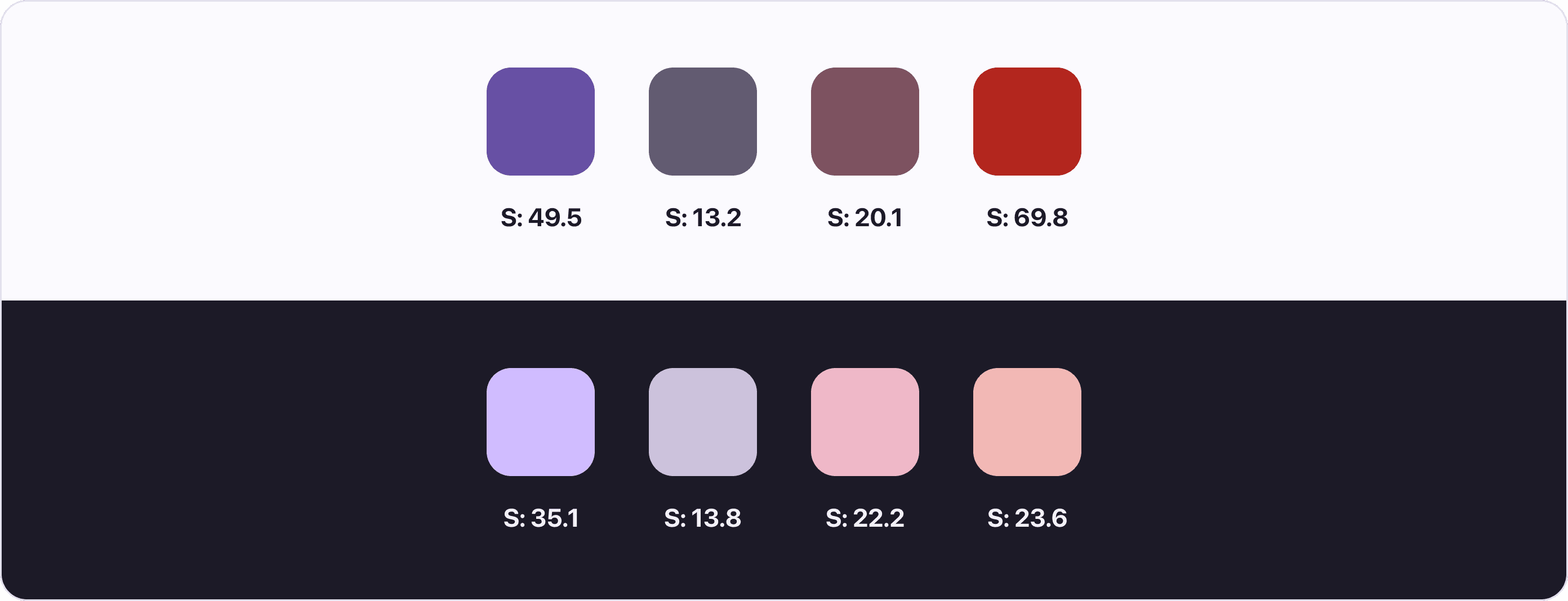
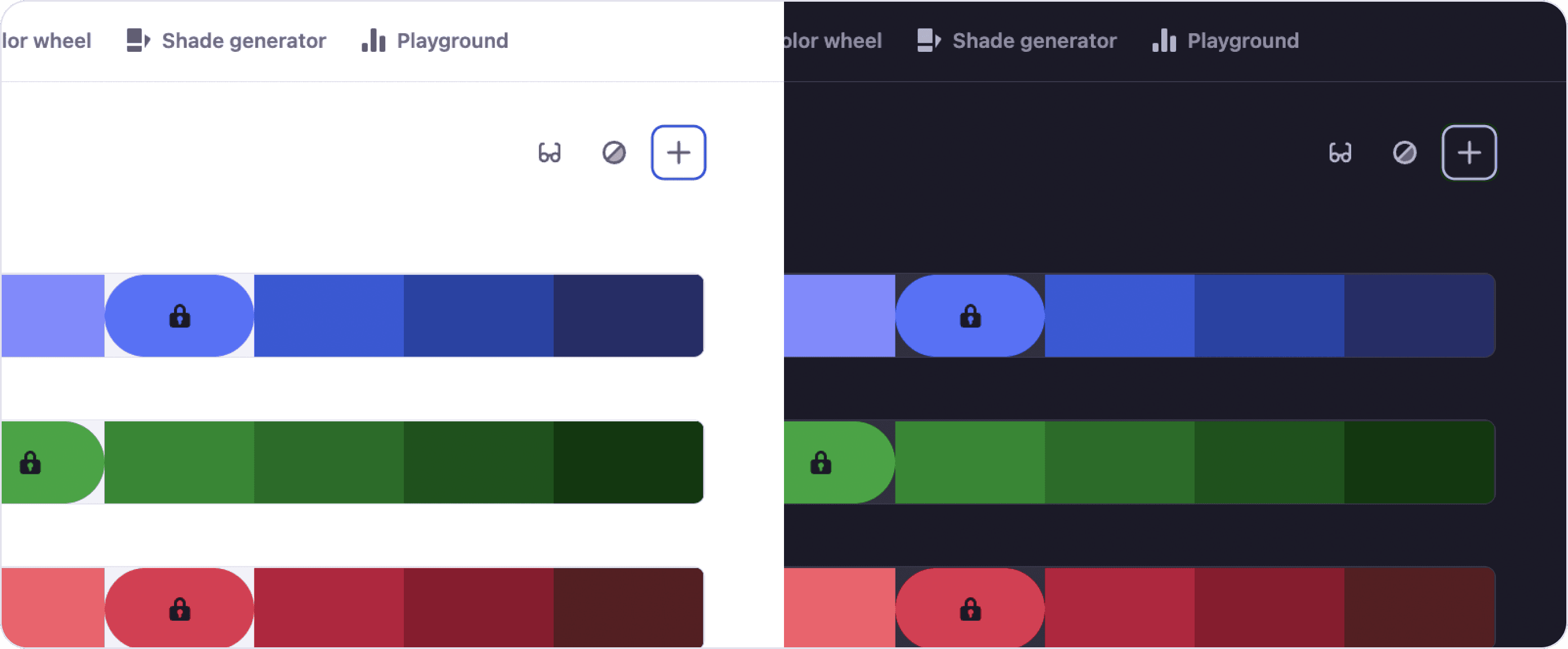
1. Avoid using saturated colors
Saturated colors create optical vibrations when on a dark background, causing eye strain. It can also be hard to pass accessibility standards with saturated colors on dark backgrounds.
Desaturate colors to make them easy on the eyes, with enough contrast against the dark surface. How much saturation is enough? In general, your colors should have around 20 points lower saturation on dark mode than on light mode. See below how Google approached their theme colors.
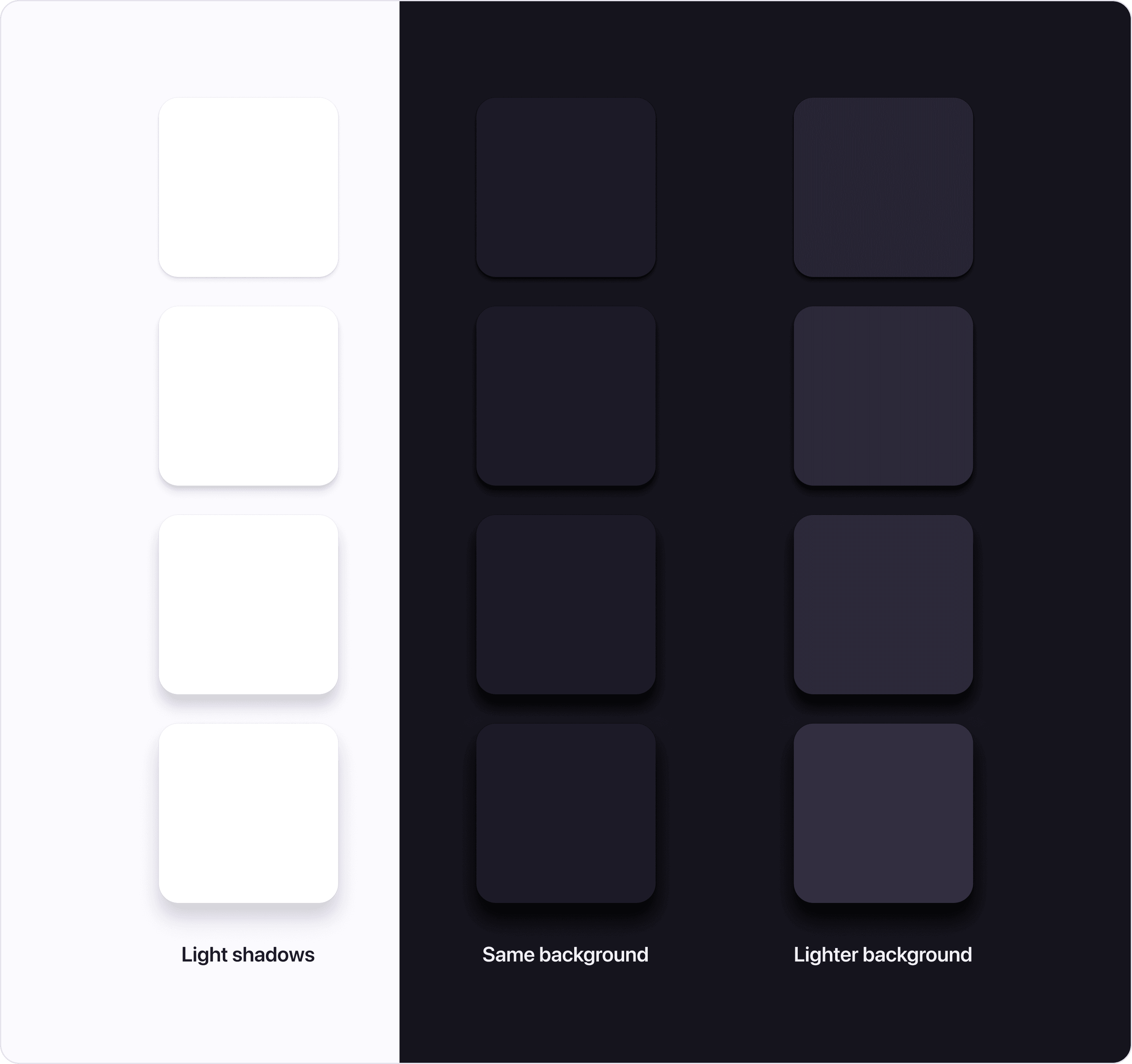
2. Communicate elevation with lighter surfaces
In light mode, we usually use shadows to communicate depth. The higher the surface is, the closer it is to the light source and the bigger shadow it casts. While this approach wouldn't work in a dark mode, we can use the same "light source" theory and apply it to the surface color.
So instead of changing only the shadow size, we can also make the surface lighter the higher it is. Think about the light source being closer and shining brighter on the surface.
3. Avoid pure black surfaces
Your first instinct might be to choose pure black as the default surface color. But be careful, white text on a black background has such a high contrast that it might be hard to look at.
Choose dark grays for your default surface color. White text on a dark gray background has lower contrast and is easier on the eyes. Another advantage is that you will be able to use shadows on dark gray surfaces.
4. Avoid pure white
Same as pure black isn't ideal for a dark theme, bright white can glow too much in a dark UI, creating a jarring effect. Use a slightly darker shade of white to soothe the eye.
5. Don't just invert the color scheme
Inverting your existing light mode scheme to create a dark mode doesn't necessarily mean the result will have high contrast. Be patient and create a dark mode-specific color palette that has enough contrast and is pleasant to the eye.
6. Make sure browser focus indicators are visible
Many people only use keyboards to navigate apps. They use commands and focus indicators to move around the screen. If these focus indicators aren't visible, these users can't enjoy your app.
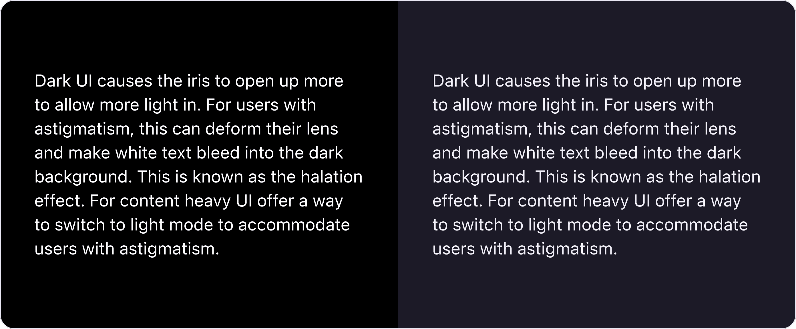
7. People with astigmatism could have issues with Dark mode
Dark UI causes the iris to open up more to allow more light in. For users with astigmatism, this can deform their lens and make white text bleed into the dark background. This is known as the halation effect. For content heavy UI offer a way to switch to light mode to accommodate users with astigmatism.
Going Dark Mode only
In some cases, you can choose to go with only a dark appearance for the whole interface. Consider carefully if it is the right choice for your use case.
For example, websites usually don't come with the option to switch modes, since the colors are part of the branding expression. Another example could be an app for watching movies (like Netflix) where you would want the UI not to distract the users from the viewing experience.
Conclusion
As you can see, designing dark mode isn't the same as light mode. There are several dark mode-specific considerations you need to make to create a great looking and accessible dark mode theme.
Are you working on a dark mode theme for your designs? Try Atmos the tool for creating color palettes.