Creating a great color palette can be a daunting task. The choices you make will impact not only users but also your colleagues. Here is our guide for creating the best UI color palette. We will guide you through every step - from finding colors, and creating shades, to naming conventions. Let's jump in!
What makes a good color palette?
Before we get deep into creating color palettes, we have to define a great palette. Every color palette has two main goals - to look good and be easy to use.
Good looking color palette
Matches the taste of our users
Evokes the feelings and emotions we need
Fits into the brand
Passes accessibility standards
To help us achieve these things, we can use color theory (we will dive deeper into color theory when finding colors).
Easy to use color palette
Has intuitive naming conventions
Removes or minimizes choice overload
Is easy to modify
Bonus: Is ready for theming, allowing us to create the mythical dark mode
If your palette is hard to use, your hard work creating the best color palette will be wasted.
Note on ready-made color palettes
It may be tempting to skip all this work and use one of the many ready-made palettes. That may be a good starting point. But since the palette is not designed with your specific use case in mind, you will soon run into issues and the need to adjust. Any great product has a well-designed palette to go with it.
Let's get started
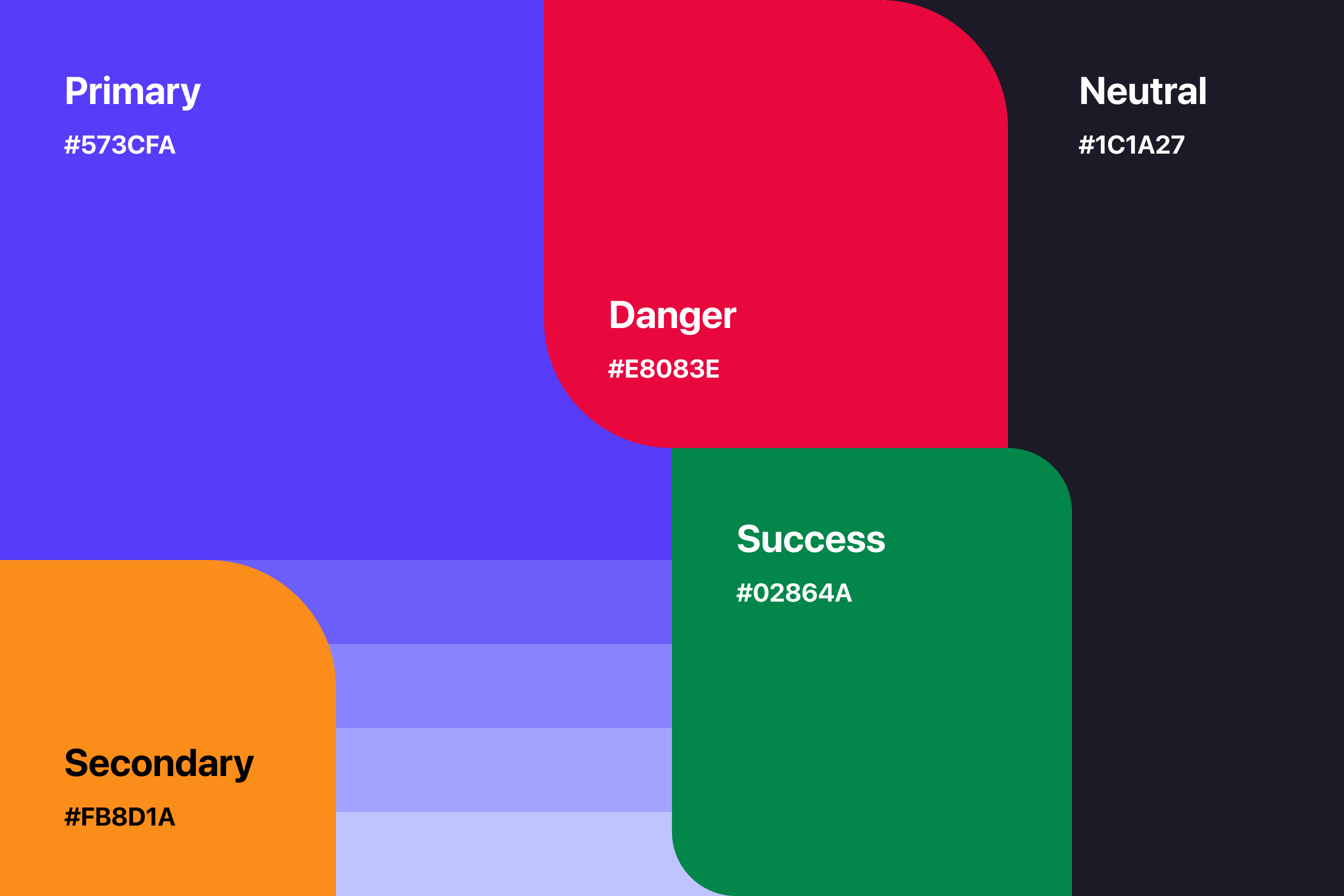
Every color palette starts with base colors. The amount you will need is specific to your project. For example, a product with lots of charts will need more base colors than a simple app. Base colors can be split into three main categories:
Primary or Brand colors
Semantic or Status colors
Neutrals
Primary (brand) colors
Most products have one, maybe two brand colors. They are used for primary actions and drawing users' attention. Brand colors are the first thing to decide on as they affect the rest of your palette.
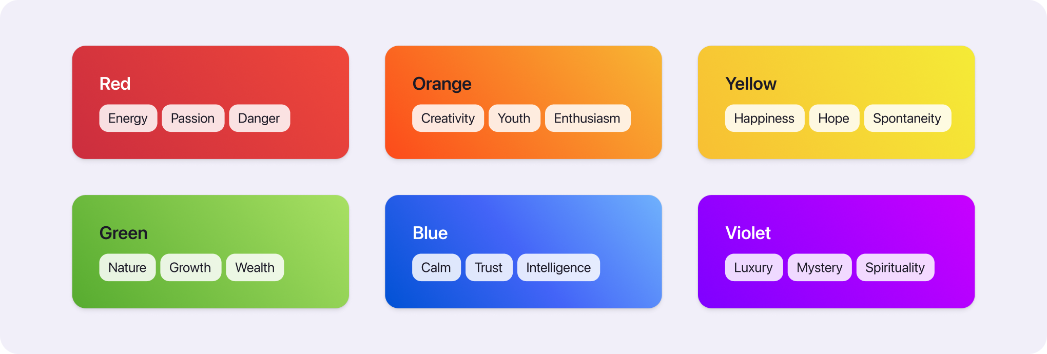
Semantic (status) colors
Semantic colors help us convey meaning to users. For example, red is seen as dangerous while green has a positive connotation. Typically you will need:
Green - for positive trends and successful states
Yellow - for warning messages
Red - for dangerous states and destructive actions
Neutrals
Most elements in your interface will use neutral colors (text, lines, backgrounds, etc.). Sometimes it's recommended to avoid using pure black on white as the contrast can be tiring to the eyes. But be careful not to go too light to keep high legibility.
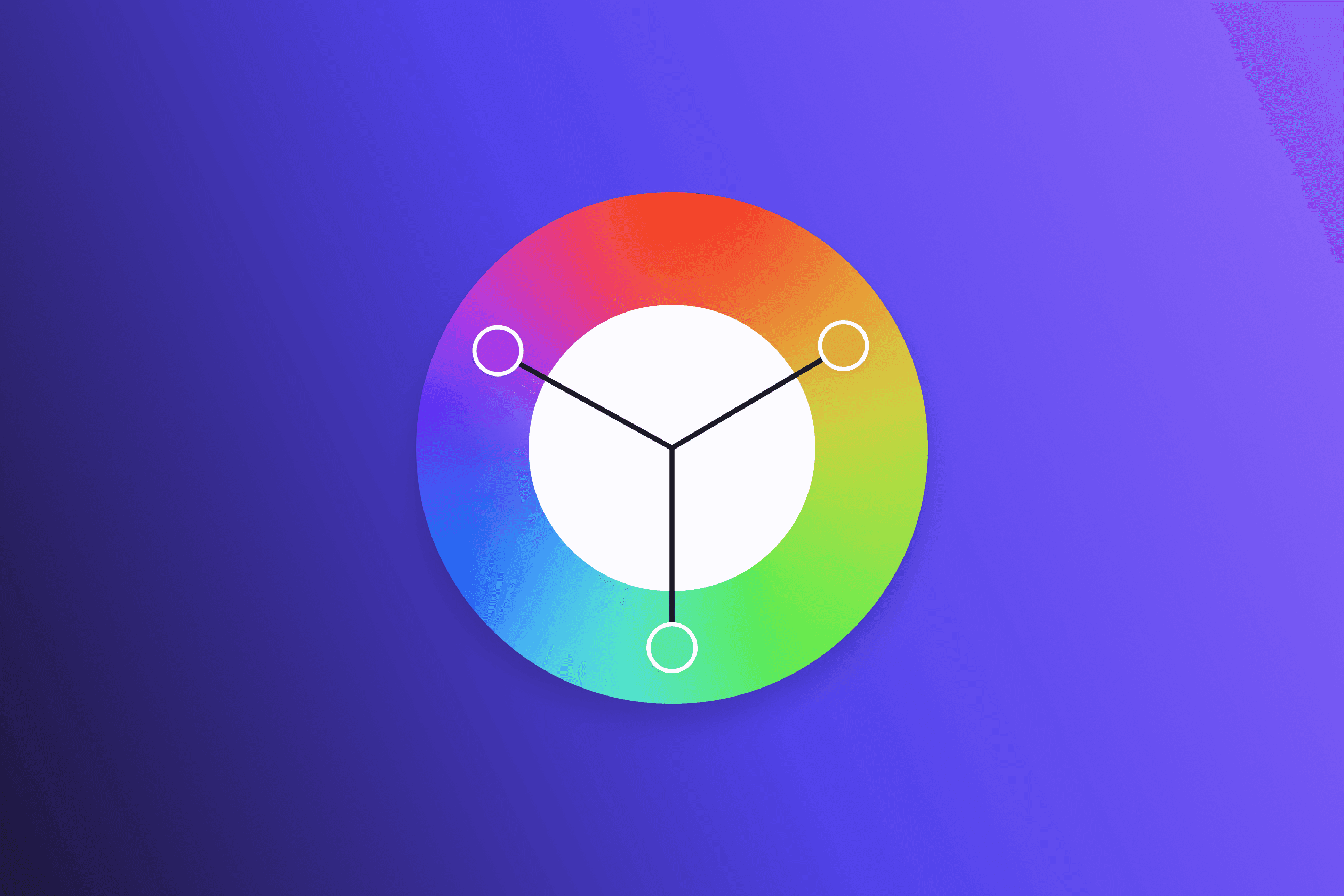
How to find base colors
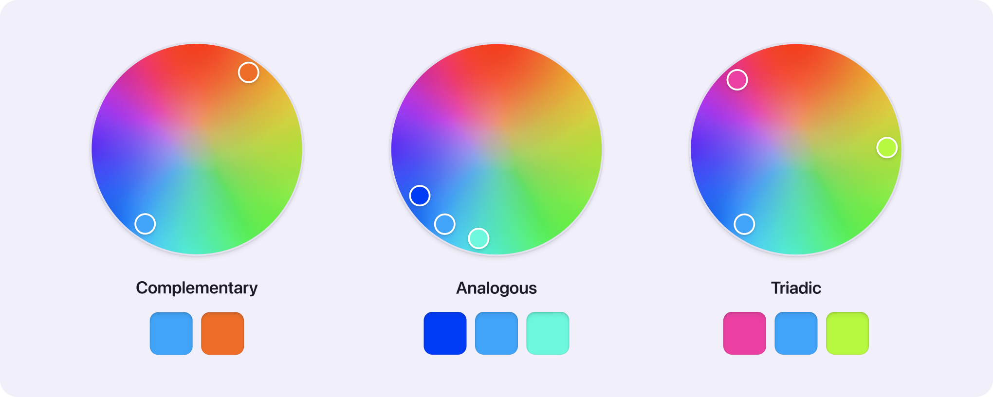
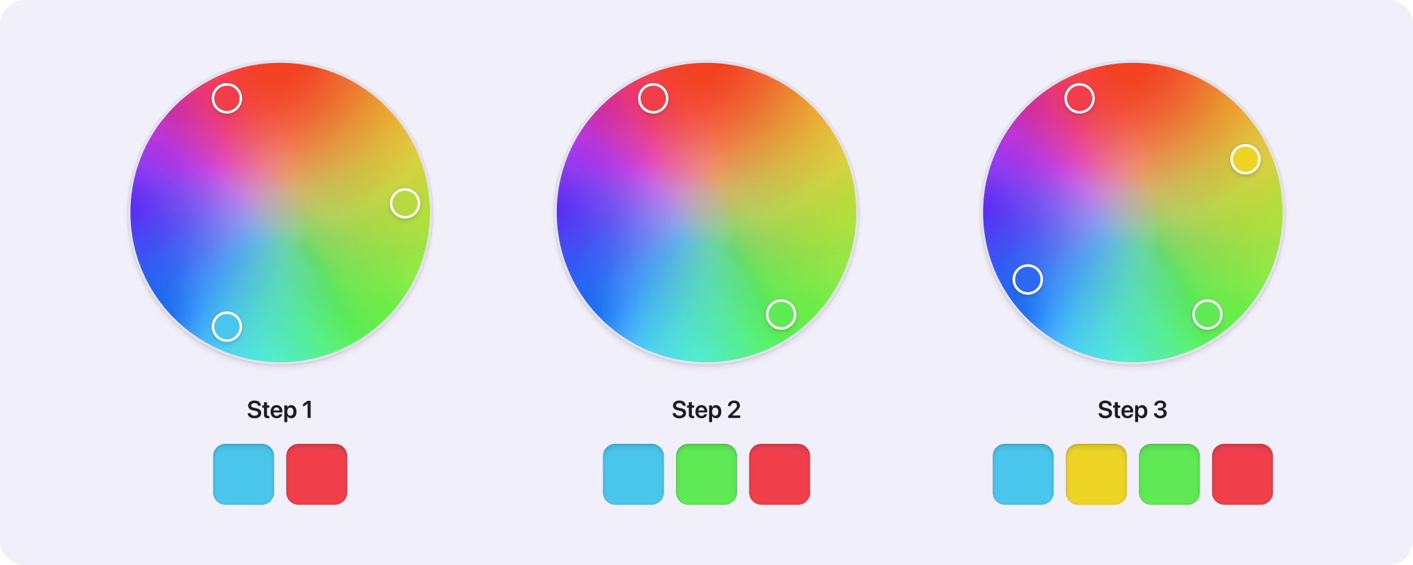
Like with all creative things, there is no single process to follow when looking for base colors. Here are a few methods that can help you:
Color meaning
Throughout human evolution, we have created associations between colors and emotions. We are drawn to red fruit over green because the color indicates ripeness. Considering these meanings when looking for colors can help us achieve the desired effect. But keep in mind that color meaning can vary across different cultures.
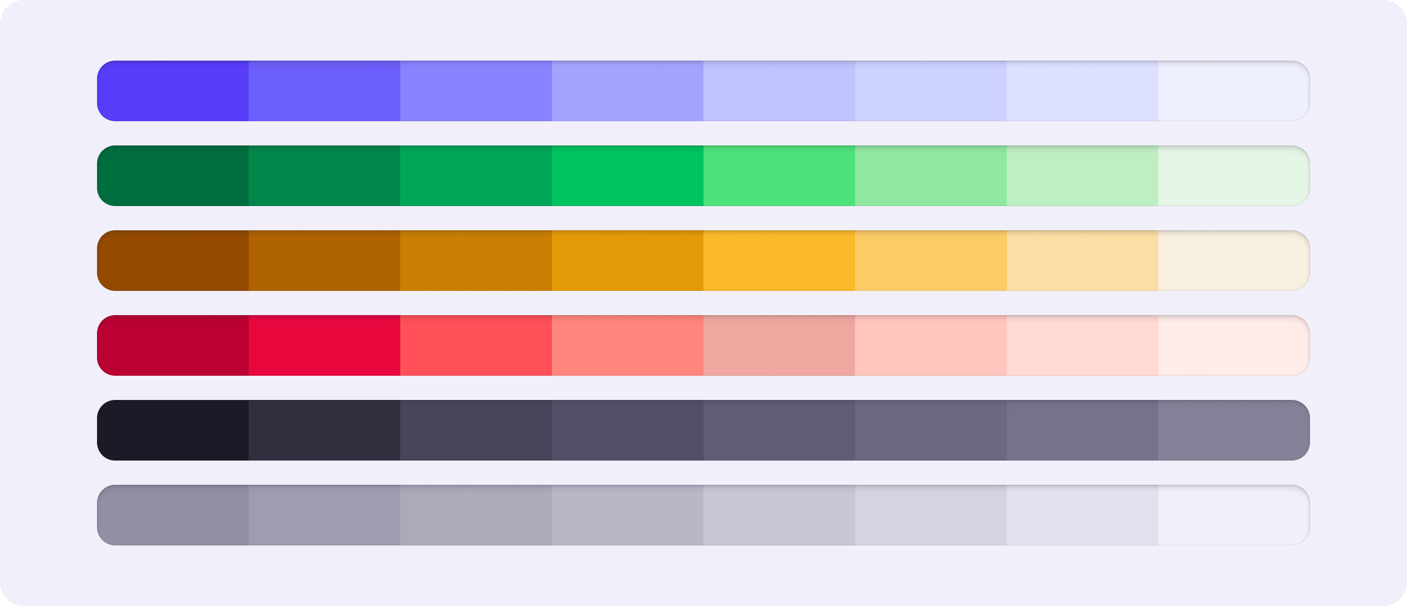
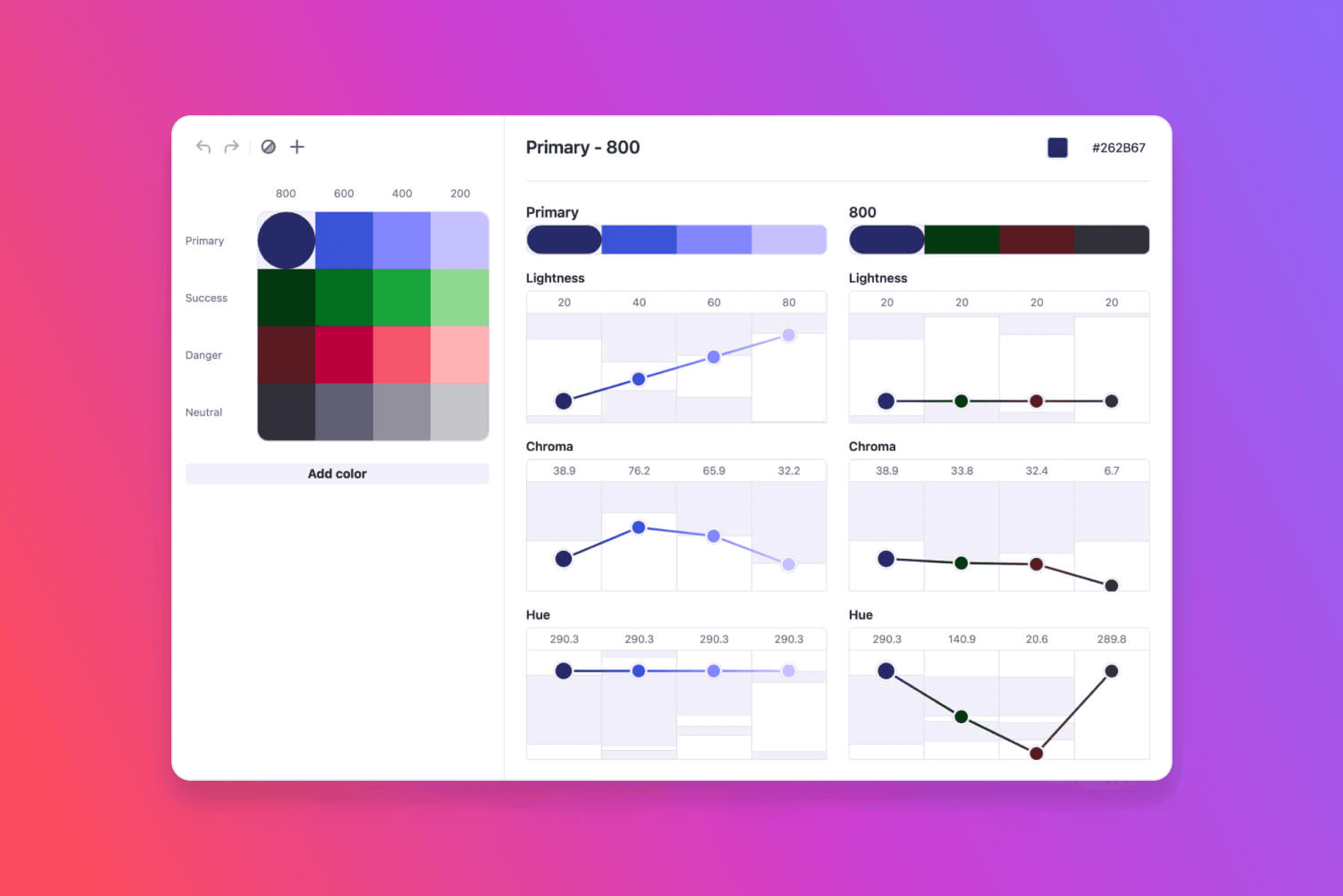
After you have your base colors, it is time to start creating shades from them. Shades are necessary to have a flexible palette for all possible use cases and contrast needs.
How many shades are enough?
Most palettes have around 6-10 shades per color and around 10 shades for the Neutrals (grays).
More shades = more choices and maintenance
It may be tempting to create as many shades as possible "Just to be safe". But this will leave you with decision paralysis when designing. Rigorously trim down the number of shades until you end up with a flexible yet compact palette. Remember that you can always add more if necessary.
Lightness
To determine the darkest and lightest shades, consider how you will use them in the interface. Dark shades are used for text while light shades are mostly for tinted backgrounds. It's best to test your shades on an example UI (a few fields, buttons, and boxes should do the trick).
Generally, a lightness range of 95 to 30 seems to be the sweet spot. Any lighter and the colors are barely distinguishable. On the other hand, darker colors lose saturation rapidly.
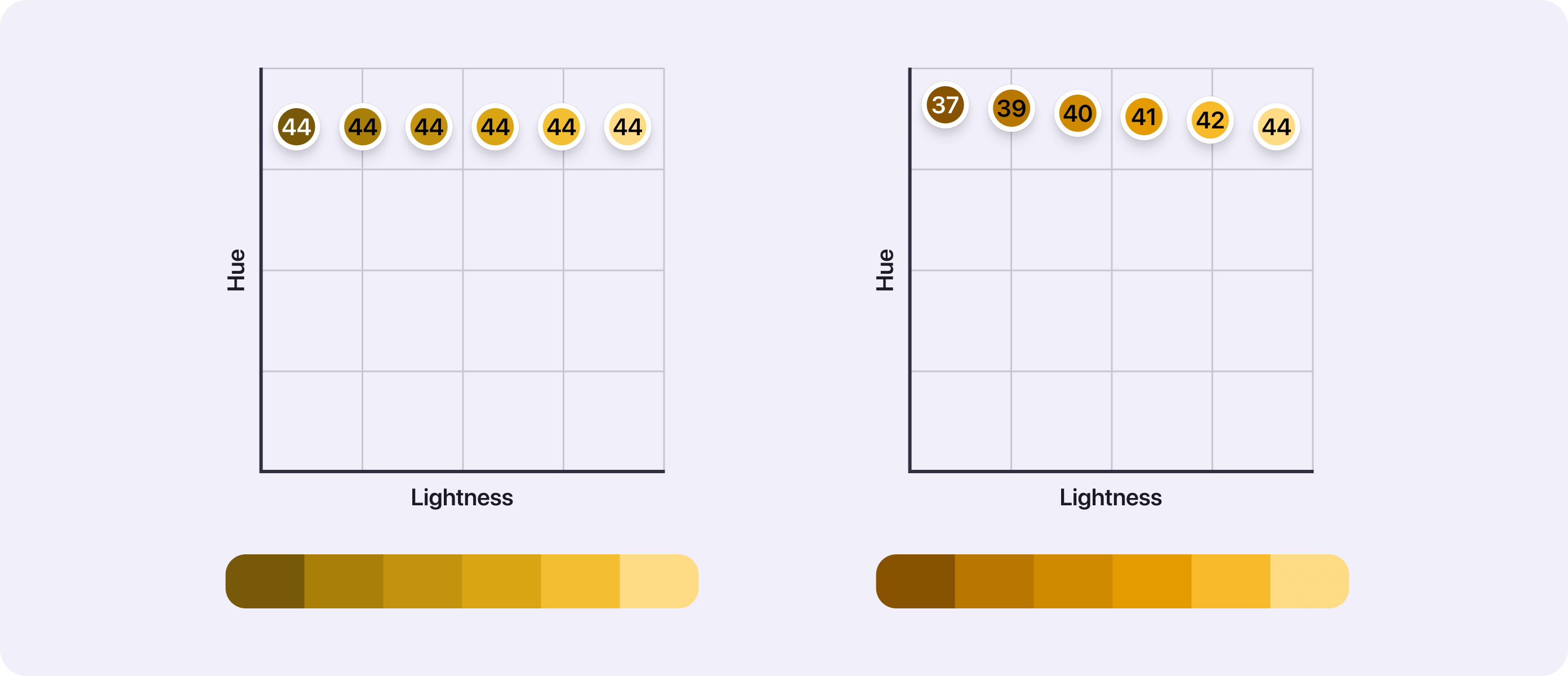
Hue shifting
One way to make your shades feel just right is to shift the hue values. This method slightly changes the hue value as you move from light to dark shades. Leaving you with vibrant colors.
For example, yellow is a good candidate for this. As you decrease lightness, the nice yellow becomes muddy. To avoid that, you can slowly decrease its hue value towards orange and red. The result will be nicer dark yellowish-orange shades.
Yellow with the same hue compared to hue shifted yellow
Some colors benefit from this method more than others. Experiment, try wild shifts and you may find the perfect shade for you.
It's good to wait with choosing saturation until you have the lightness and hue values set. When choosing the saturation, there are two things to keep in mind:
Too many saturated colors together can overwhelm users
Saturation draws attention, don't overuse it in your designs
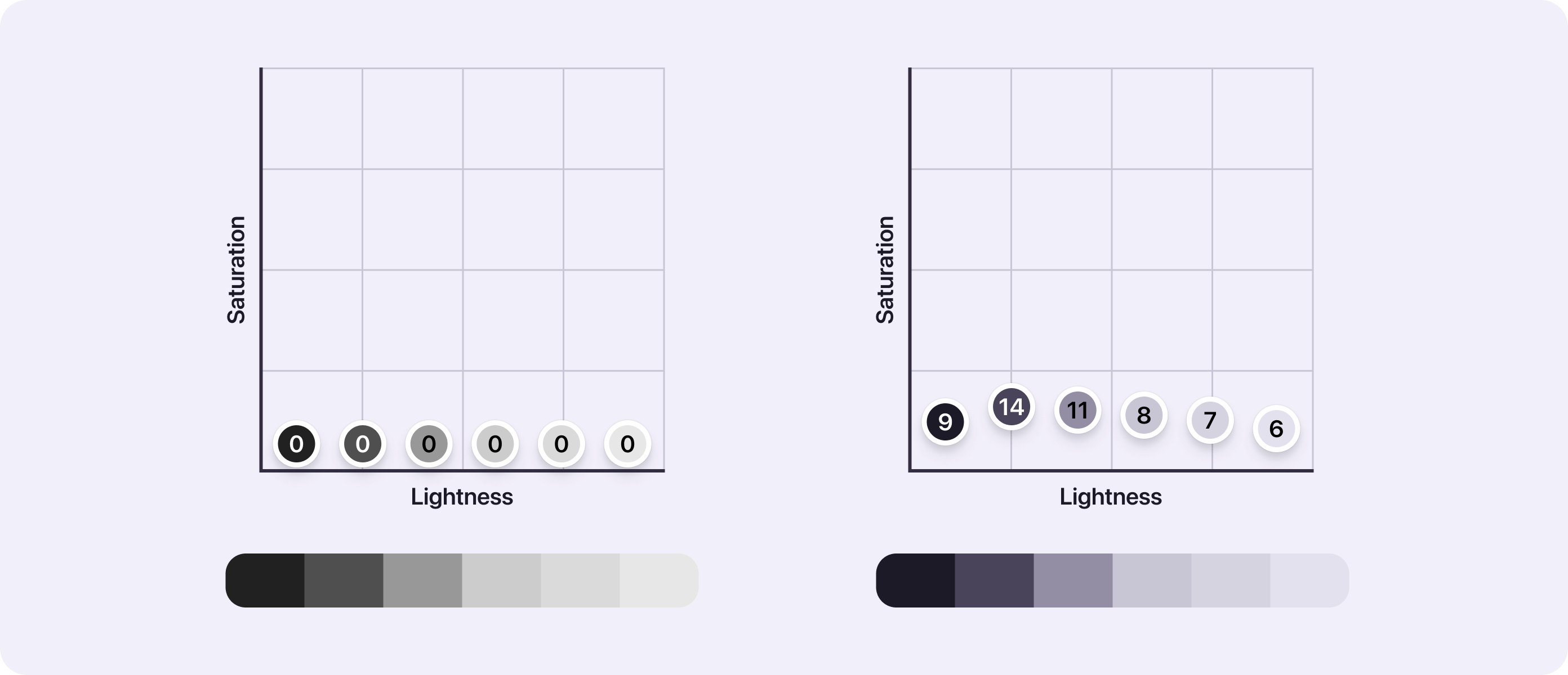
Saturation of neutral colors
Pure grayscale doesn't exist in nature and may seem unnatural. It is a common practice to use the primary color's hue with low saturation. This results in tinted grays that work nicely with the rest of your palette.
Pure grayscale compared to tinted grays
What about color accessibility?
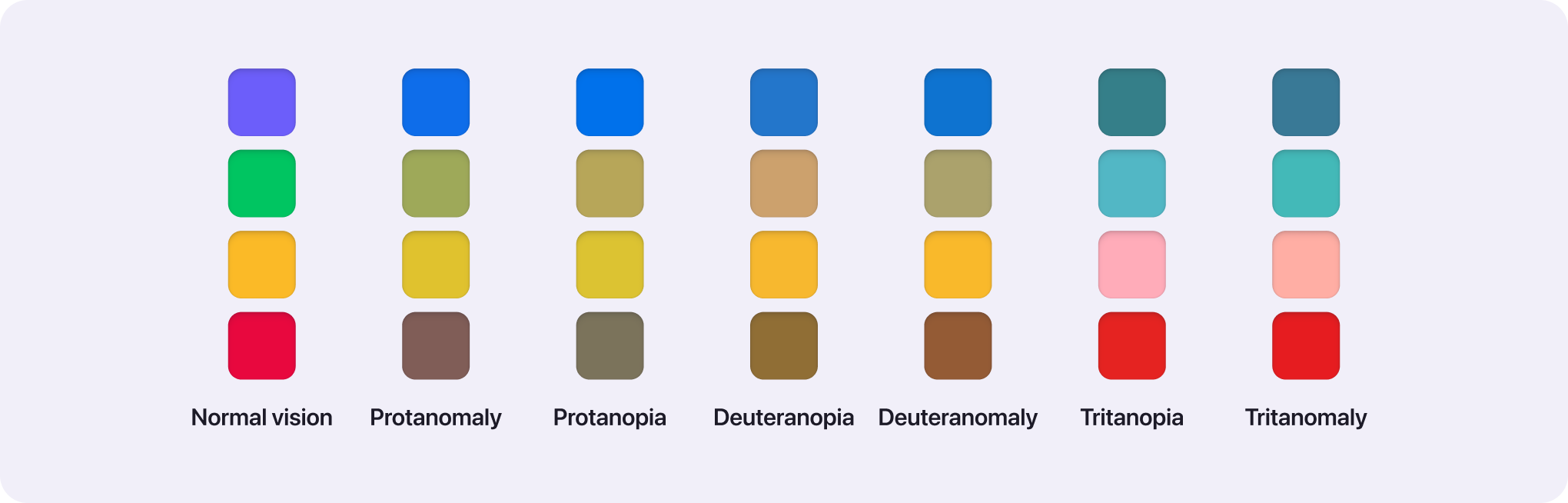
Not everyone perceives color the same way. According to WHO estimates, 2.2 billion people have some kind of vision impairment. So it's really important to consider if your colors have enough contrast and if they are distinguishable.
This is why Atmos comes with a built-in contrast checker and color vision simulator so you can ensure accessibility at every step of your color palette journey.
Color contrast
It's good to think about how your colors will be used in the interface now so you don't have to come back later. For example, will you need to put text on tinted backgrounds, how will your primary button look like, and so on? Continuously check the contrast ratios between the shades you plan to use together and double-check later in your designs.
To ensure color combinations are distinguishable check your colors using color-blind simulators. Don't rely only on color to convey information, use words or iconography as support. Learn more about these techniques in WCAG guideline 1.4.1 Use of color.
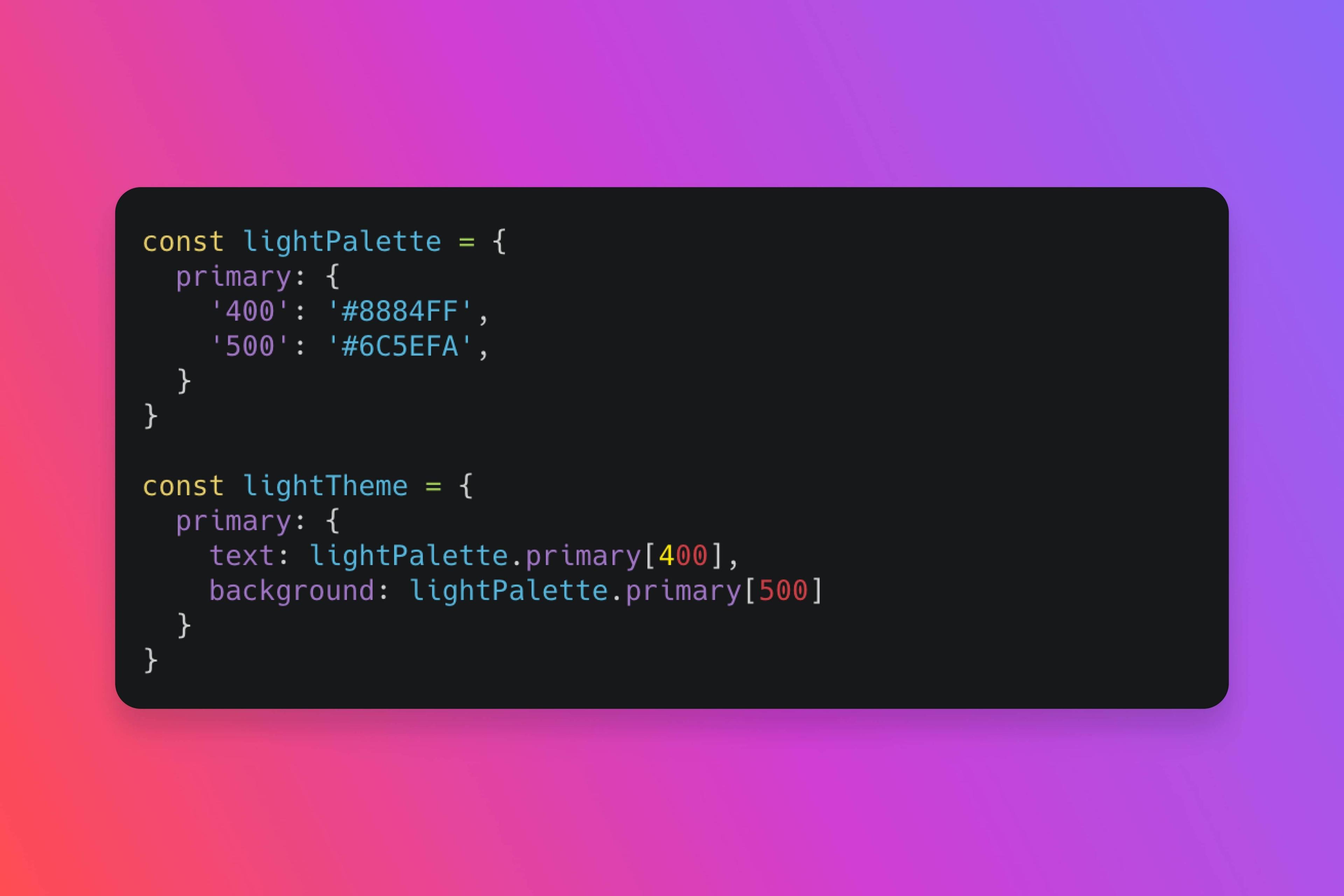
Naming convention
Naming conventions can make or break a palette. Why? Intuitive naming conventions have a big effect on the color palette's internal usability.
Colors
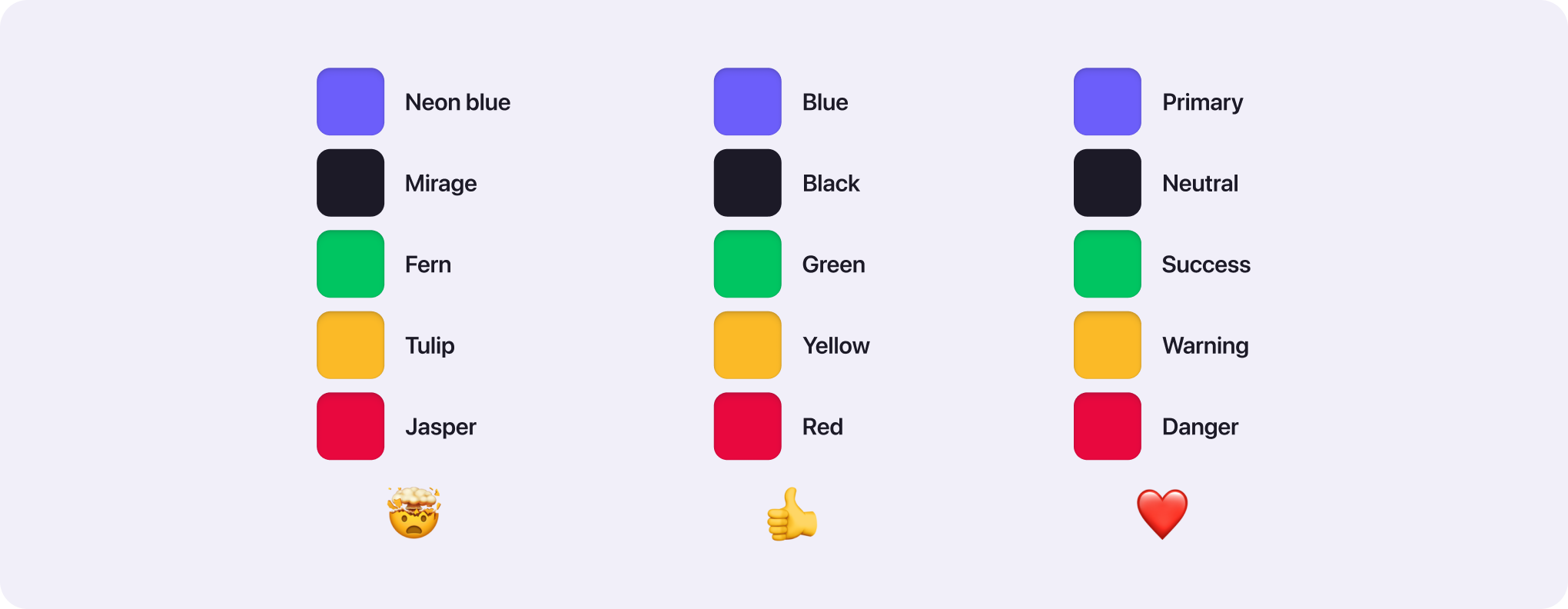
There are multiple approaches to naming your colors. You can use abstract names, real names, or the color's function. We recommend the latter as with this approach nobody has to remember if the success color is emerald or lime. The most common functions are:
Primary - main brand color
Secondary - accent brand color (you don't always need secondary color)
Success - for successful states
Warning - for warning users
Danger - for dangerous actions like deleting stuff or error states
Neutral - all your grays, whites, and blacks
Abstract vs. Real vs. Function color naming conventions
Shades
The most flexible and predictable naming convention for shades is numbering from 0 (white) to 1000 (black). The numbers are assigned based on the lightness of the shade.
Adjectives vs. Numbered naming convention
Why are numbers the best? This approach gives you the room to expand your palette without renaming existing shades. For example, if you would like to add a new shade between Primary light and Primary lighter, how would you name it? With numbers, you would have Primary 400, Primary 300, and add Primary 350.
Tools to your rescue
There are many tools out there that will help you on your journey of creating the perfect color palette. Here are some of our favorites:
Atmos
We've designed Atmos to be THE tool for creating a color palette - from finding colors through generating shades to fine-tuning your palette. If you're a total beginner or design professional, Atmos has everything you need to create your color palette.
Color wheels
Adobe color wheel - advanced color wheel with a lot of customizability
Canva color wheel - simple and nice color wheel with a great color theory explanation
Color generators
Coolors - generates nice color combinations (mainly good for graphics and illustrations)
Colorable - while this tool is a contrast checker, you can use the randomize feature to find interesting color combinations.
Palx - generates color palette based on a single color value
To sum it up (TLDR)
Creating a color palette is a complex and important process. Follow these principles to achieve the best results:
A great color palette is determined by: how it looks and how easy it is to use.
Set proper naming conventions from the start
Use color theory to find base colors
Create 6-10 shades by manipulating the lightness, saturation, and hue of your base colors
Make sure your colors are accessible and distinguishable by everyone
If you enjoyed this article, I'm sure you will find Atmos helpful. Whether you are just starting a color palette, or your current could use some tweaking, then you should give Atmos a shot! Hey, it's free 🚀