All you need to know about color theory in UI Design
Color theory helps designers choose colors that look great and evoke the right emotions. Learn about the color wheel, color schemes, color spaces, and more.
Ondrej Pesicka • February 22, 2022 • Updated July 20, 2023
Color theory is a set of guidelines to follow when working with colors. They explain how humans perceive color, how colors mix, and the effects of color combinations. Understanding color theory is the first step in creating a color palette. There is a lot to learn so let's jump in.
What is color?
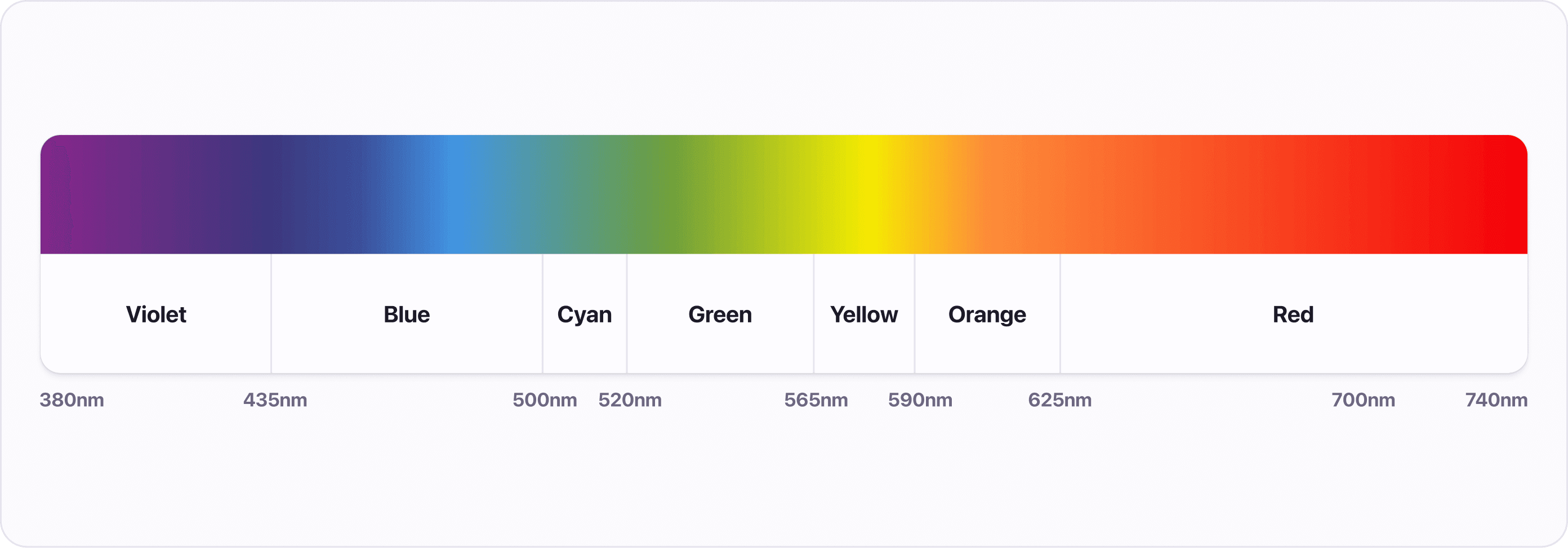
Color as we see it is the result of light with different wavelengths going into our eyes. The light can be either reflected or emitted and our eyes interpret its wavelengths as colors. Because we are talking about digital interfaces, we will mainly focus on the emitted light.
Color wheel
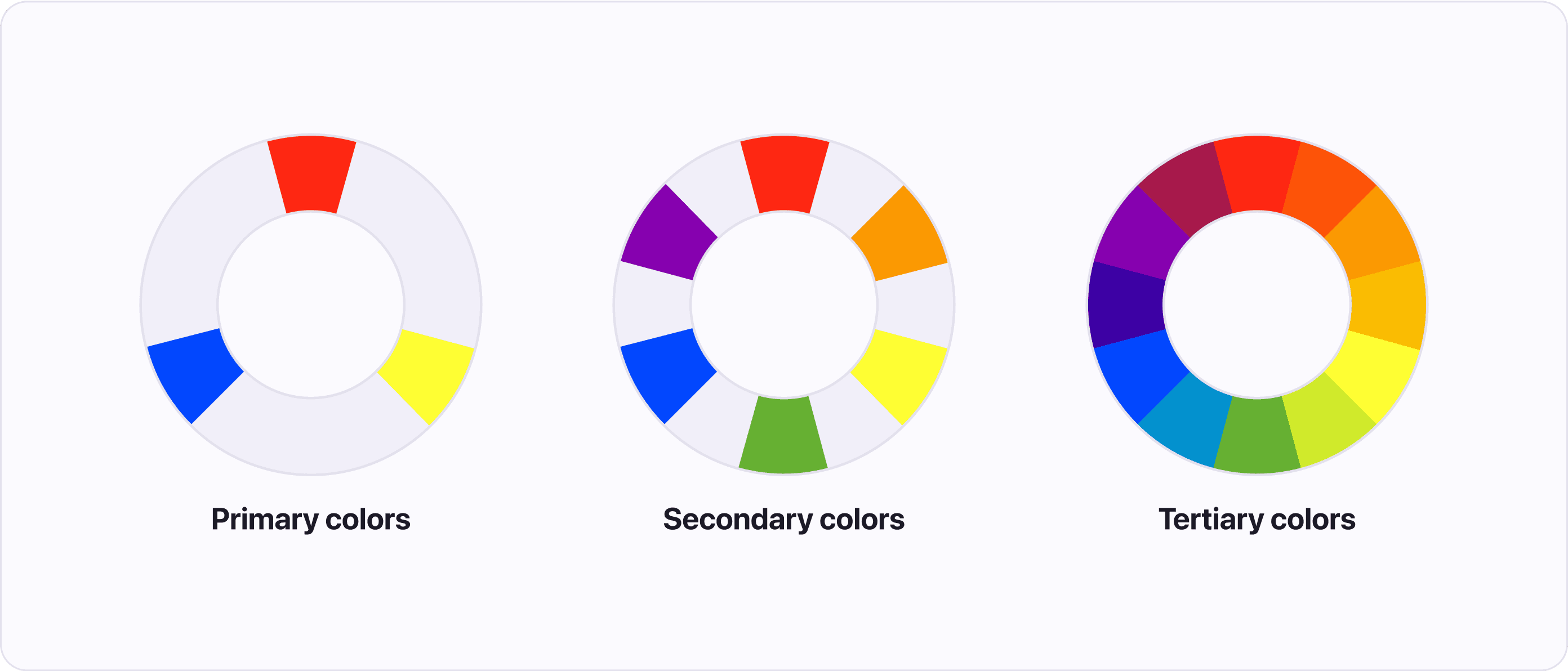
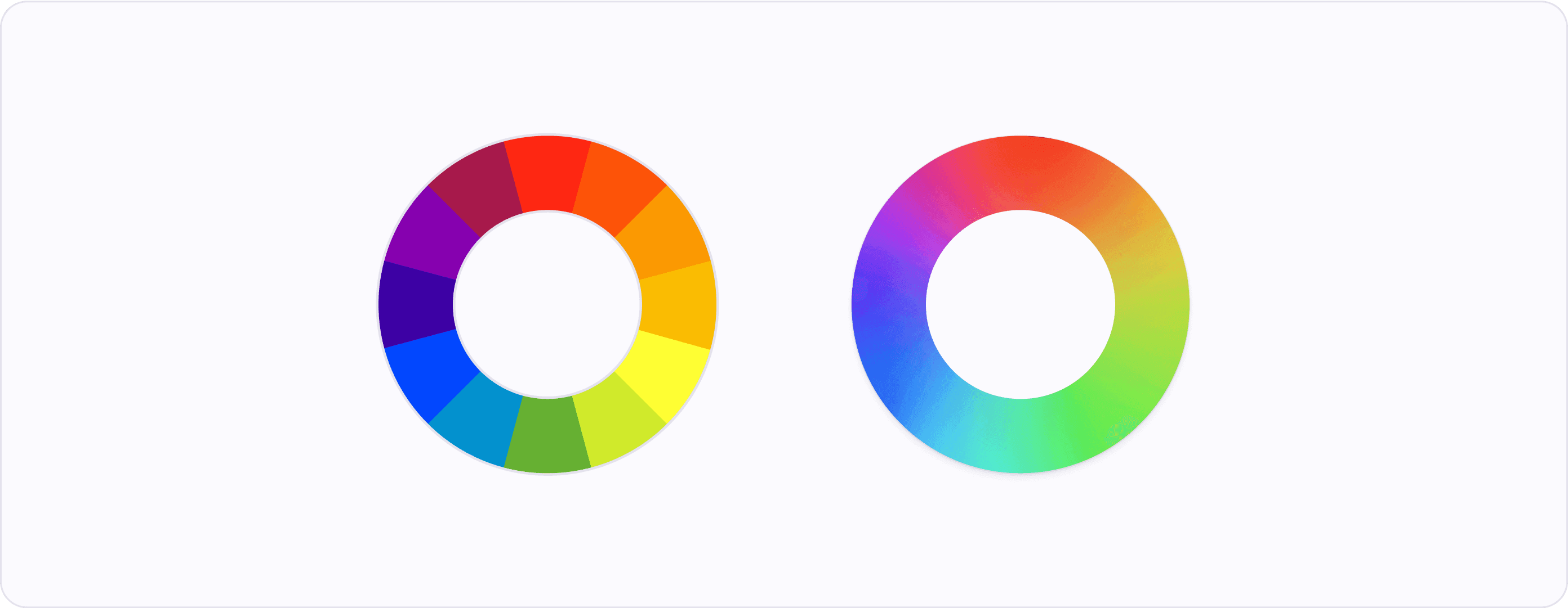
A color wheel (or color circle) is a handy tool that can help you find nice color combinations. It shows the relationship between colors in a logically arranged sequence of hues, which is helpful when creating a cohesive color scheme. The wheel is made up of 3 groups of colors:
- Primary colors (red, yellow, and blue) - the main colors from which all other colors are created.
- Secondary colors (green, orange, and purple) - created by mixing the primary colors.
- Tertiary colors - created by mixing primary and secondary colors.
The color wheel described in traditional color theory most commonly visualized as having clearly defined boundaries, but it is a gradient (or spectrum) of colors that blend into each other. There are no clear boundaries where one color starts and stops.
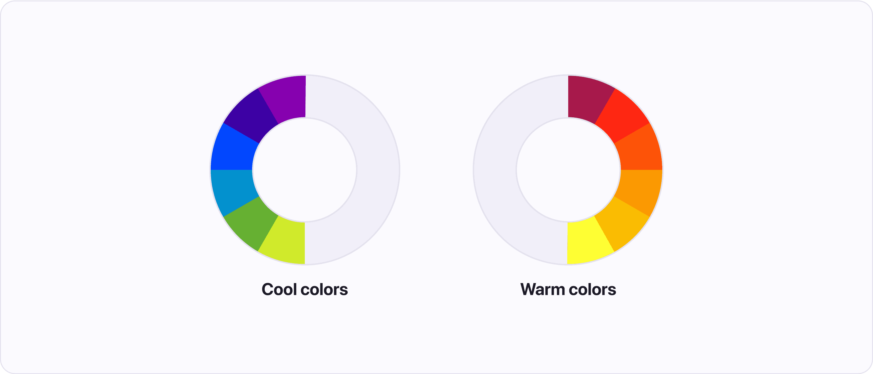
Color temperature
Temperature refers to the warmth or coolness of a color. Color temperature helps us to convey moods, and create emotions in our users. But it's important to consider the cultural context as not everyone has the same emotional response to color.
Color theory divides the color wheel into two parts: Warm colors and cool colors:
- Warm colors are made up of red, orange, and yellow. These colors are associated with energy, passion, and brightness.
- Cool colors are located on the opposite side of the wheel and are made up of blue, green, and purple. These colors are associated with peace, calmness, and are soothing.
Color schemes
Color theory describes multiple predefined arrangements of colors around the color wheel. Designing with these color schemes helps to achieve visual harmony.
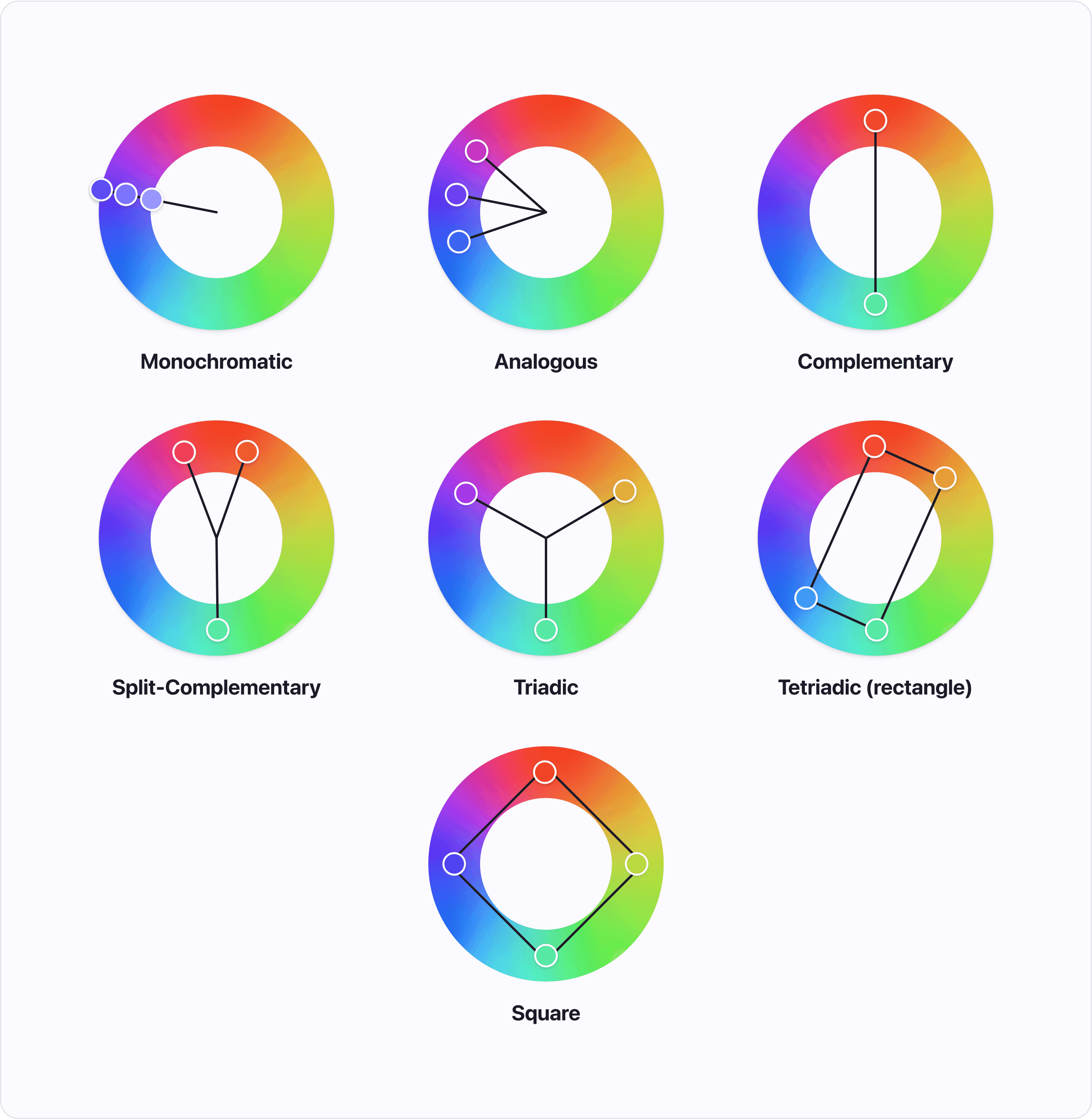
- Monochromatic - Colors created from one hue by adding black or white. This color scheme is simple, but it's not recommended for use in User Interface (UI) design because it can be hard to visualize information with just one color.
- Analogous - Three colors next to each other on the color wheel. This scheme is commonly found in nature. Pick one color as your primary color and use the other two as accents.
- Complementary - Colors opposite of each other on the wheel. This color scheme creates high contrast.
- Split-Complementary - Combination of complementary and analogous color schemes. Results in three colors, two next to each other and one opposite of them.
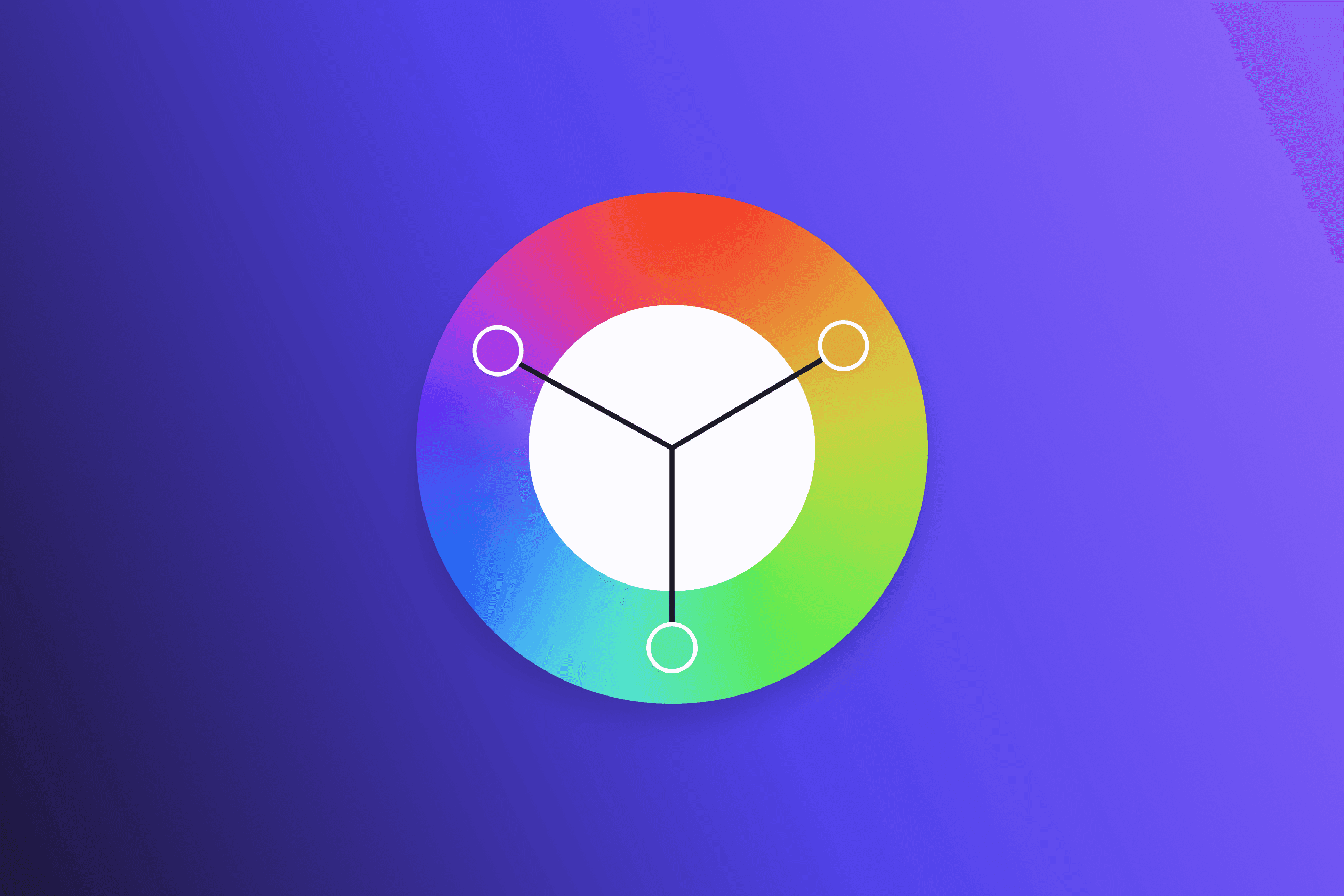
- Triadic - Three colors evenly spaced around the color wheel. This creates a scheme with high contrast and a sense of harmony.
- Tetradic - Created by combining two complementary pairs resulting in four colors in a rectangular pattern on the color wheel. Pick one color as your primary color and use the others as accents. This color scheme can be harder to balance.
- Square - Four colors evenly spaced around the color wheel. This scheme is more versatile than the tetradic scheme, as all colors can be used in a similar amount, creating a more balanced design.
These schemes are how Atmos’ color generator creates harmonious color combinations with one click.
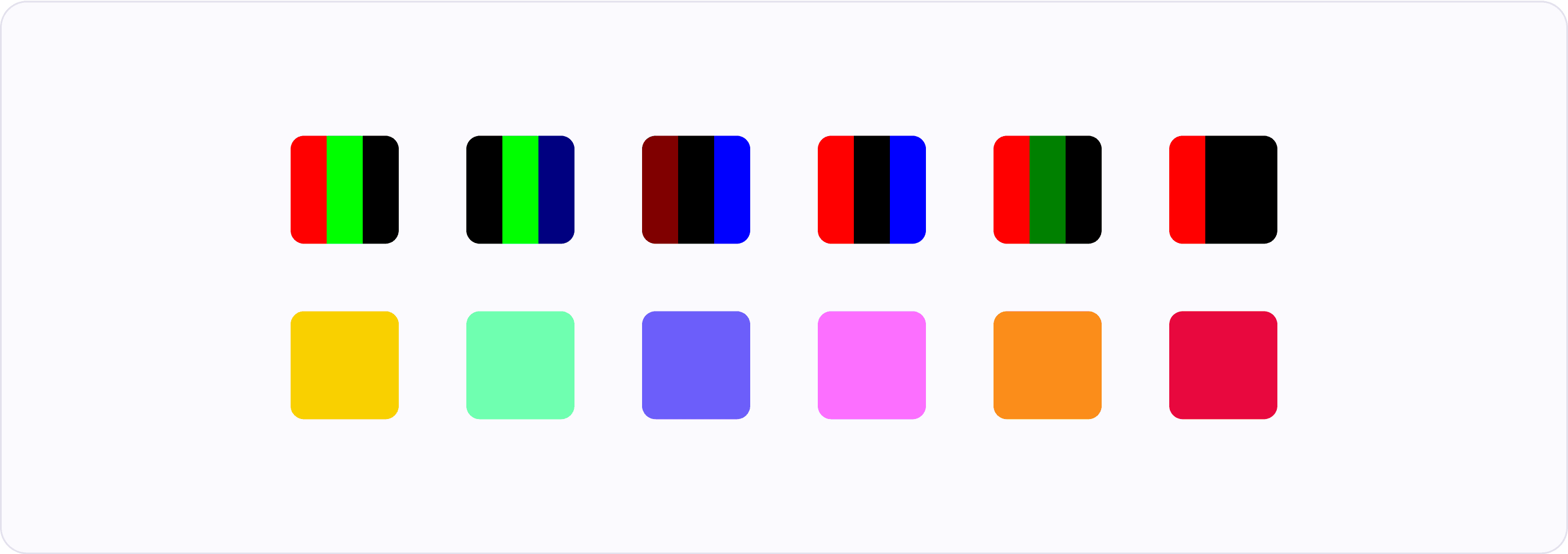
Color meaning
From the time we evolved, humans have associated colors with different emotions. For example, we are naturally drawn to red fruits because that color usually indicates ripeness. When looking for colors, it is important to be aware of these meanings, but remember that they can vary across different cultures.
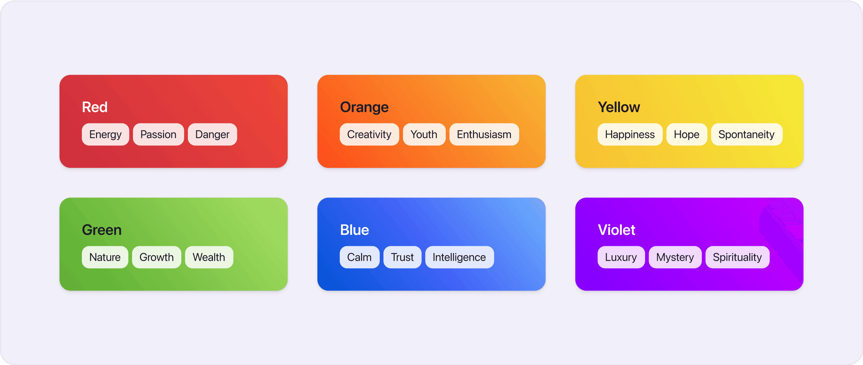
- Red - Energy, Passion, Danger
- Orange - Creativity, Youth, Enthusiasm
- Yellow - Happiness, Hope, Spontaneity
- Green - Nature, Growth, Wealth
- Blue - Calm, Trust, Intelligence
- Violet - Luxury, Mystery, Spirituality
Check out Atmos's color generator to find colors that are in line with your desired meaning.
Color context
Our perception of colors can change depending on the colors that surround them. Some colors can look lighter / darker or more / less saturated, depending on the colors around them.
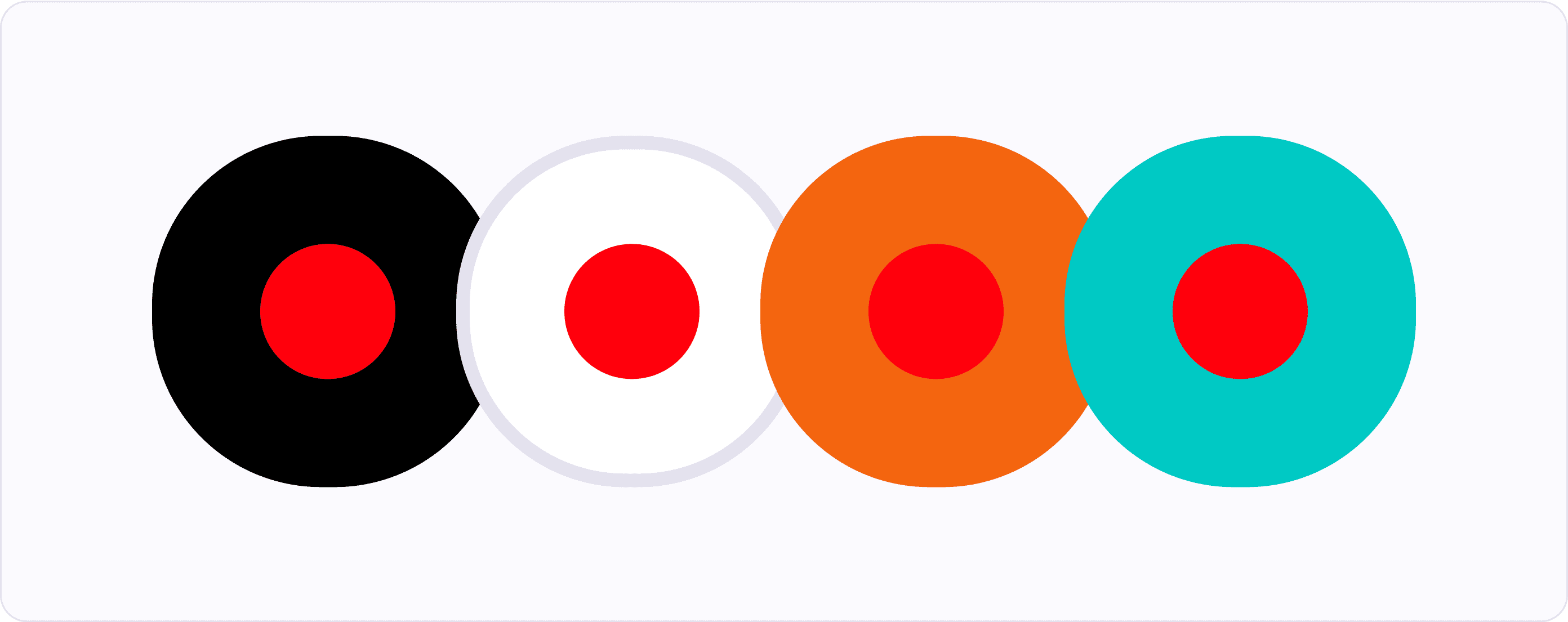
When light colors are surrounded by dark colors they appear lighter. Similarly, dark colors surrounded by light colors appear darker.

If you have a moderately saturated color and you put it on a background that is highly saturated, the color will look less saturated. But if you put the same color on an unsaturated background, it will look more saturated.

These effects are most noticeable when the colors have similar hues or when they are complementary colors. Other colors are generally barely affected.
How are colors defined?
While working with colors, you will meet terms like hue, saturation, and tint. Although you can get by without knowing what exactly these terms mean, it's good to learn about them to have a better understanding how colors work.
Hue
Hue is the foundation of color. When you talk about colors you are unusually talking about hues. For example “red”, “green”, and “blue” are hues of color.

Chroma
Chroma is a quantitative measure of how pure a color is when compared to a white with the same lightness.
Colors with low chroma appear washed out (think of pastel colors), on the other hand, colors with high chroma are intense (with no black, white, or gray added) and visually strong.

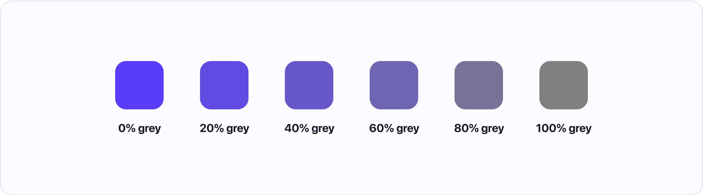
Saturation
Saturation is a qualitative measure of the purity of color based on how it appears in its environment and light. By adding black, white, or grey to a color we can lower its saturation.

Lightness
Sometimes called value describes how light or dark a color is. In many color spaces, the lightness value is relative to how computers see it, but some (like CIELAB color space) describe lightness by how human eyes perceive it. This helps with creating a consistent color palette.

Tone
To tone a color you add grey to it. Tone is similar to saturation and chroma and most people use only one of the names when talking about colors.
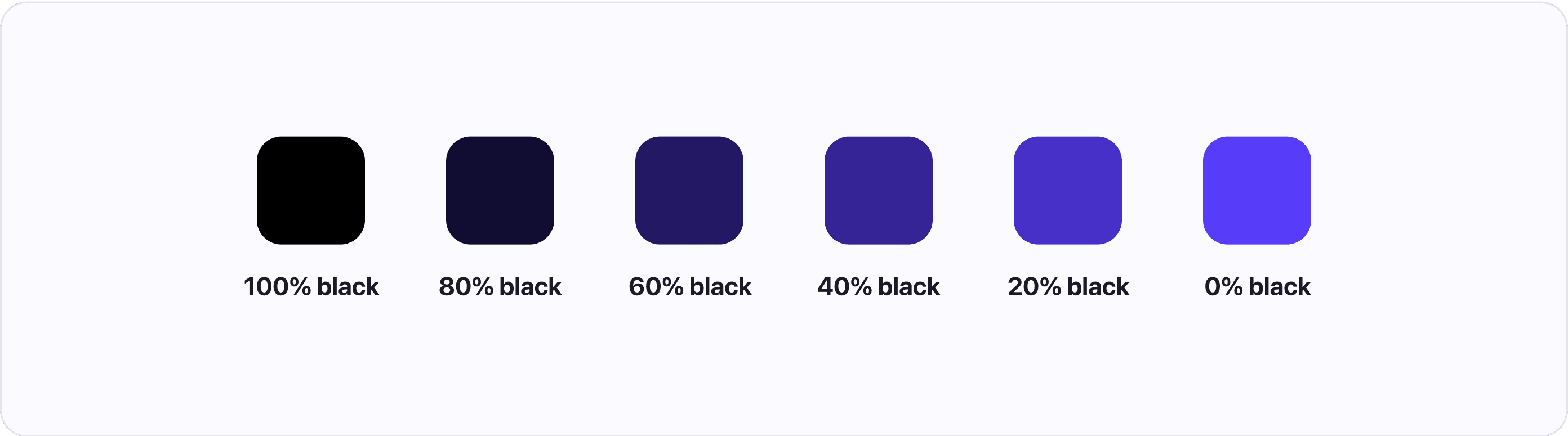
Shade
Shades are colors you create by adding black to any pure hue. You can create multiple hues just by changing the amount of black you add.
Most people say shades when talking about lighter or darker variants of a hue. However, each method has a different name.
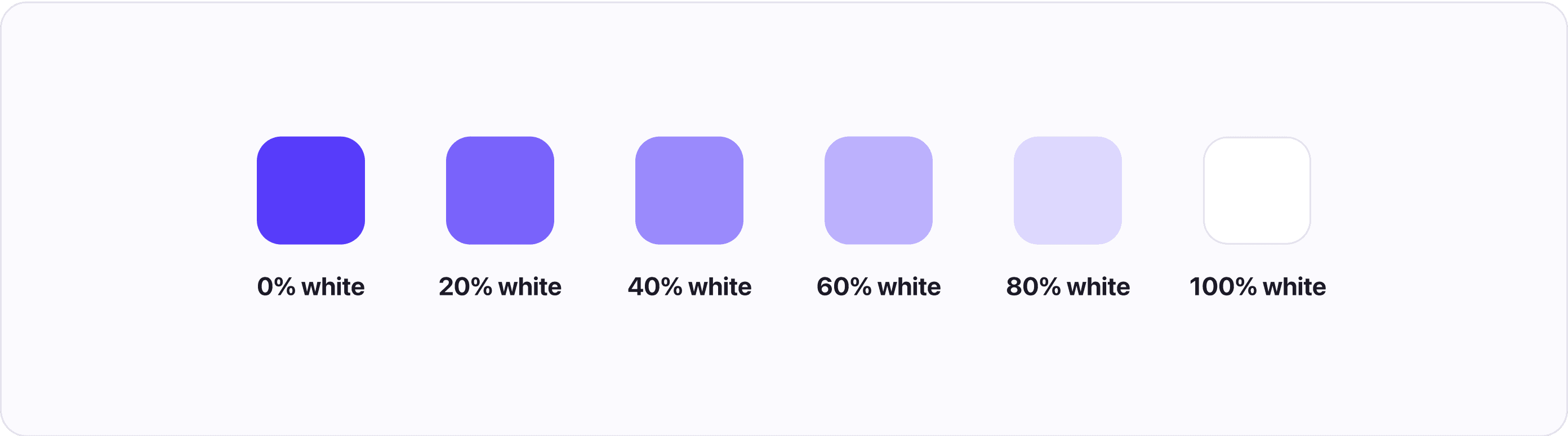
Tint
Tints are the exact opposite of shades. They are created by adding white to any pure hue. You can create multiple tints by changing the amount of white you add.
Understanding color spaces
To produce colors on our display, we need to tell the computer what color we want. We do this by using color spaces, which organize and describe colors so that they can be reproduced. For example, when you use a HEX code, you are referencing colors in the RGB color space using hexadecimal numbers.
Because of how current display technology works all color spaces are eventually converted into a variant of RGB so they can be displayed by the RGB pixels (which are made up of red, green, and blue diodes). But that doesn’t mean that RGB is the best color space for working with colors, as we will soon find out.
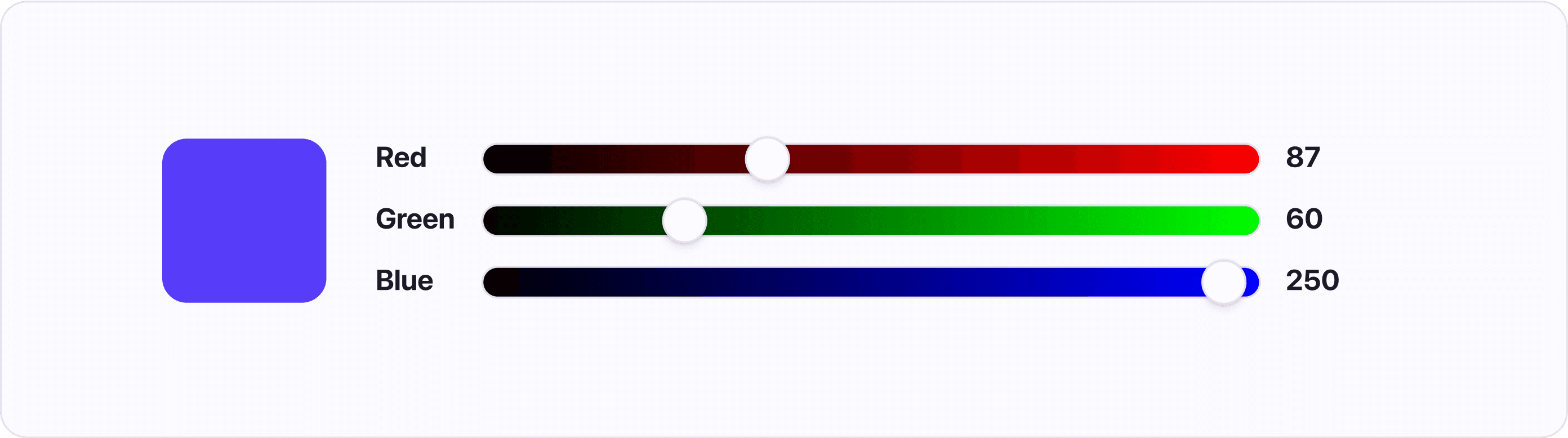
RGB color space
The RGB color space works by mixing Red, Green, and Blue colors to create 16,777,216 unique colors (assuming you are using a 24-bit display). Although RGB is great for computers, it is hard for humans to understand what colors are being described. You have to guess what values to use to get the desired color.
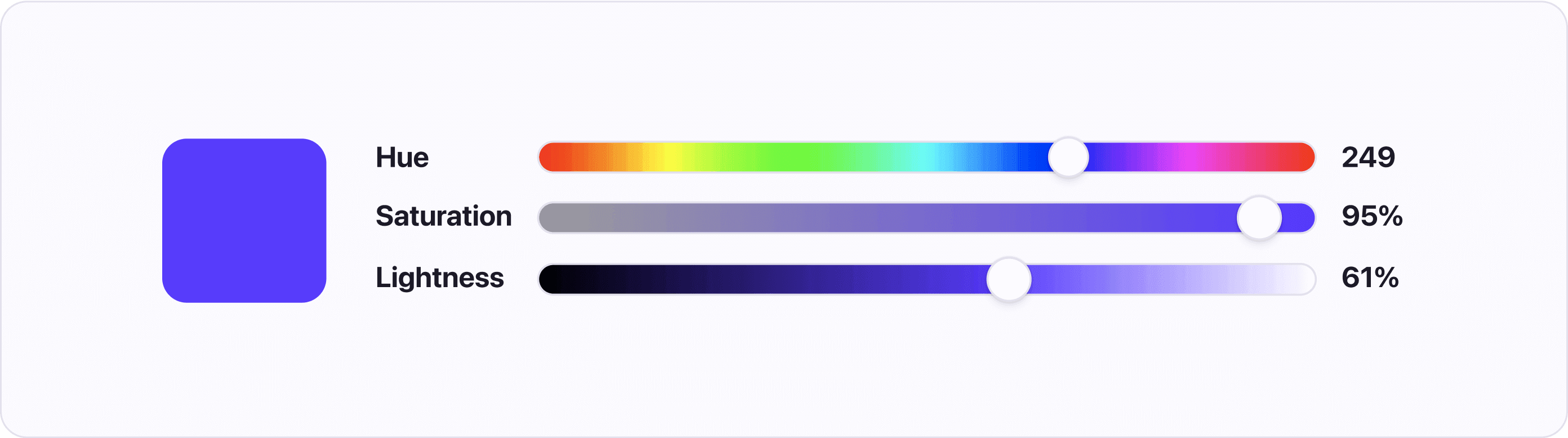
HSL color space
HSL stands for Hue, Saturation, and Luminosity. This way of describing colors helps designers pick the desired colors. While HSL is well supported in design tools and code it has a similar flaw to RGB in that it describes colors for computers, not human vision. The way HSL calculates lightness doesn’t take into account how different hues are perceived by human eyes.
CIELAB, LAB, CIELCh, LCH color spaces
These color spaces are all variations of the CIELAB color space, which was designed to model human perception of color. In other words, the color spaces are perceptually uniform.
Perceptual uniformity means that if you pick a list of hues with the same lightness and saturation and put them next to each other, the colors will start to blend. That is due to each color having the same perceived lightness and saturation.
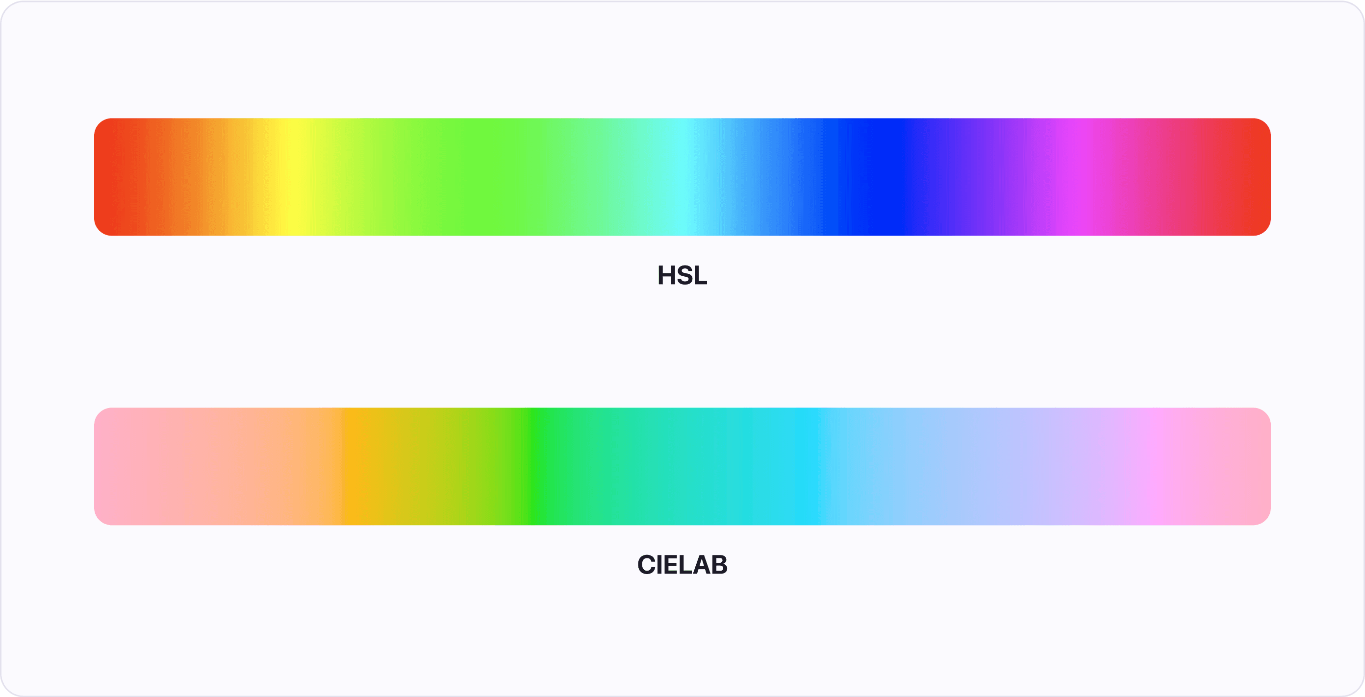
This fact makes the color spaces great for creating color systems that are accessible, consistent, and predictable - meaning that you can easily swap one color for another without any major changes to contrast or visual weight.
Take away about Color theory (TLDR)
Color is an important part of any design. Using color theory makes it easier for designers to choose the right colors.
There are many color spaces each with its advantages and disadvantages. Our recommendation is using the perceptually uniform color space CIELAB.
The color wheel is a useful tool for finding harmonious color combinations. To find colors we can utilize different color schemes, such as:
- Complementary scheme - colors opposite of each other
- Analogous scheme - three colors next to each other
- Triadic scheme - colors evenly spaced around the wheel forming a triangle
Color temperature and color’s cultural meaning can help us with choosing colors that will evoke the right emotions, but it is important to consider cultural differences.
If you've enjoyed this article, I'm sure you will find Atmos helpful. Whether you are just starting with a new color palette, or your current palette could use some tweaking, then you should give Atmos a shot! Hey, it's free 🚀