Theming with React and Styled Components
Working with colors and creating a theme can get messy. Learn how to structure a palette and theme, implement dark mode, and use CSS variables to avoid duplication.
Vojtech Vidra • February 9, 2022 • Updated October 23, 2022
Working with colors and creating a theme can get messy because colors are spread everywhere. We'll learn how to avoid common issues and organize colors better. In this article, you will learn:
- How to create a theme with Styled Components, Emotion or any other CSS-in-JS library
- How to create Dark mode for a web app
- How to never duplicate colors in code
- How to take advantage of TypeScript to improve DX
We've used this approach to create Dark mode for our app Atmos. We can iterate on our color palette and change it in a matter of seconds. Thanks to naming convention in Figma and our codebase, anyone can easily find the color they need.
Without further ado, let's jump right in!
Using variables
Don't use colors directly. Always put them in a variable. CSS variables are better than SASS or JS variables, even if we're building a JS app with styled-components. We will show you later in the article why.
With this approach, we don't have to repeat ourselves. If we need to change some colors they're all in one file.
.button {
  background-color: #123456;
  /* ⛔️ Not good, prefer variables */

  background-color: var(--button-background);
  /* ✅ Much better, don't repeat yourself */
}
Using meaning
It's pretty common to use the same color for a couple of elements. Maybe the color of our primary text is the same as the background color of our primary button. Now imagine the text is too light and doesn't have enough contrast. We will need to change the color of the text while keeping the original color for our button. That is why it's better to name our variables by their use case rather than their relation to the palette. For example, it is better to name a color background rather than white, or button-background rather than primary-dark.
This approach is great when building a dark mode that requires two separate palettes (one for light and one for dark). At that point, naming colors by their use case is the only sensible option.
.button {
  background-color: var(--primary-dark);
  /* ⛔️ Not good, in dark mode,
  it's probably not dark anymore. */

  background-color: var(--button-background);
  /* ✅ Much better, consistent with dark mode */
}
Naming convention
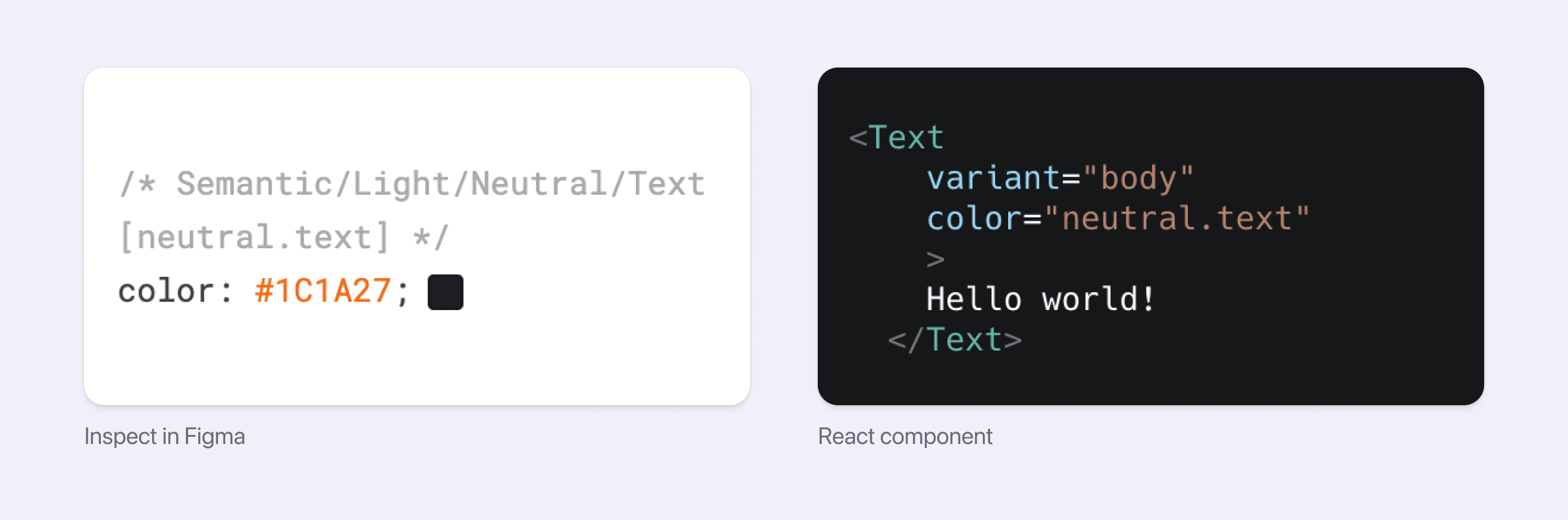
A naming convention is a must-have for larger teams, but it makes sense even for smaller teams. It's like building Rest API without any documentation. In the example below, we can see inspect in Figma with the same color key [in square brackets] that we'll use in the React component next to it. Having the colors clearly named in Figma removes any questions about which colors to use, especially for new joiners.
Sticking to one color notation
When creating your theme, it's better to stick to one notation to avoid duplicate colors. There are a lot of options. Most of the time, hexadecimal format is used and when we need alpha channel we might use RGBA.
It's better to use hexadecimal numbers because it's more concise. It can also be written in 8 character format to add an alpha channel with great browser support. This enables us to share 6 character HEX for non-transparent and transparent colors.
.button {
  background-color: rgba(1, 2, 3, 0.5);
  /* ℹ️ Alpha channel in % format is nicer. */

  background-color: #12345678;
  /* ℹ️ This is shorter and more flexible. */
}
In the future, we could also use a wide gamut display-p3 or Lab color spaces. These can describe much more colors than RGB color space. Unfortunately, wide gamut colors are currently supported only in the latest Safari browser (late 2022).
Tip for converting percentages to HEX
We may need to convert percentages to hexadecimal notation. The following is a simple JS function that will make our life easier.
const percentToHex = (percent) => Math.round(percent * 255).toString(16);

// Example:
percentToHex(1); // Output: "FF"
percentToHex(0); // Output: "00"
percentToHex(0.9); // Output: "E6"
Putting it all together
Let's take a look at how to create a theme for your application.
Building a theme
First off, we will need a color palette. We can use a ready-made palette like Material UI or leverage our guide on How to create the best UI color palette to create our own. We can also jump right into Atmos to generate one in a matter of minutes.
It could be tempting to take the color palette, turn it into a JS object, and call it a day. That would work (kinda), but there's a better way!
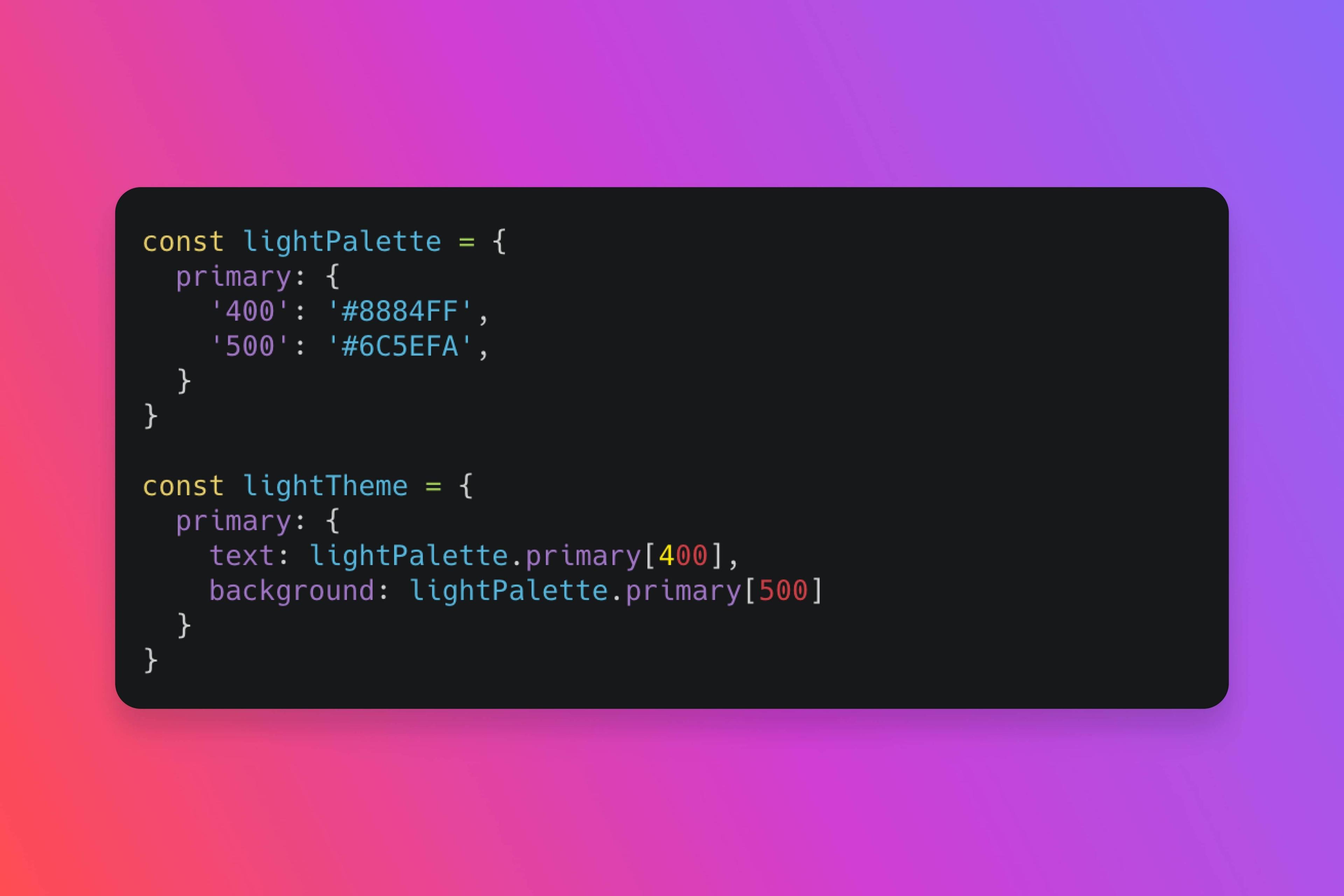
In the code snippet below, we have two objects, our color palette, and our theme. Notice each has its purpose.
const lightPalette = {
  primary: {
    300: '#A3A4FF',
    400: '#8884FF',
    500: '#6C5EFA',
    600: '#573CFA',
  },
};

const lightTheme = {
  primary: {
    text: lightPalette.primary[600],
    background: lightPalette.primary[500],
  },
};
Palette
The palette stores your colors. Typically, the palette has primary, neutral, success, and danger colors. It's important to note that the palette should be the only place where we store our colors. There could be some HEX codes in our SVG icons, but we can always overwrite those using colors from our theme. Other than that, you won't find a single HEX outside of the palette.
Theme
The theme gives meaning to our palette. For example background, text, text subtle, primary text, card background, icon, etc. As a rule of thumb, the theme is the only place, where the palette is used. If you need another color for your new component, don't use the palette directly, instead create a new item in your theme, and you're good to go. By sticking to this approach, the setup is very flexible and scalable.
Avoid flicker with CSS variables
We have created a theme and now we would like to use it. If you're using any CSS-in-JS tool, the most straightforward way is to pass the theme object into a Theme provider. That would work, but it has one major flaw if you're using SSR or SSG.
Consider this scenario: You build your app for production, and by default, it is in light mode. The user enters your app and has dark mode selected. Because you have baked your colors into the generated JS classes, all your classes have to regenerate into the dark mode. That results in a brief flicker of light mode before the app regenerates the classes.

CSS variables to the rescue. Since you can create CSS variables for both light and dark themes at the build phase. All you need to do is apply the correct theme when a user enters your app. Do this by reading the user's preferred theme and setting the corresponding class name to the html element. Because the CSS variables are still the same, your generated classes don't have to be regenerated.
Turning the theme into CSS variables
With our theme ready, we need to turn it into CSS variables. We will use a recursive function that turns each atomic value into a CSS variable with the name from its object keys. The string then can be assigned directly to :root.
const createCssVar = (items, prefix = '-'): string[] =>
  Object.entries(items).flatMap(([key, value]) => {
    const varName = `${prefix}-${key}`;
    if (typeof value === 'object')
      return createCssVar(value as ColorsItem, varName);
    return `${varName}:${value}`;
  });

export const createCssVars = (themeColors) =>
  createCssVar(colors).join(';');

// We're using lightTheme object from previous example
createCssVars(lightTheme)
// This will turn into:
css`
--primary-text: #573CFA;
--primary-background: #6C5EFA;
`

import { createGlobalStyle } from "styled-components";
const GlobalStyle = createGlobalStyle`
  :root {
    /* We assign variables to root element */
    ${createCssVars(lightTheme)}
  }
`
Tip for Dark mode
When building both light and dark modes, we will also need a way to assign the correct theme to the user based on their preferences.
System preferences only
An easier option is to stick to the system settings, then all we need is this simple media query, and that's it.
@media (prefers-color-scheme: dark) {
  :root {
    /* Your theme specific styles */
  }
}
With theme toggle
In the nutshell we will need to run JS script very quickly right after page load. The script will check if the user has a selected theme stored in local storage and eventually apply it. Otherwise we will apply theme according to system preference. After the app is loaded we can toggle between the themes by changing the class name on the html element and saving the selected theme to local storage.
Either you can come up with something or use our npm package @rbnd/react-dark-mode we have created to make your life easier.
Make the scrollbars dark
Our awesome dark theme is almost ready. There's one last thing to do our scrollbars are probably still white. Not in Firefox, because Firefox uses system settings. To fix our scrollbars and also make them dark, there is a simple css property or meta html tag to tell the browser that the scrollbar should be dark.
Using CSS variables
We have created a palette, light, maybe even dark theme. Now it's time to use our CSS variables. We can use it directly by referencing its value with standard CSS syntax.
.link {
  color: var(--primary-text);
}
Or we can create a simple (type-safe) function to help us with this. A great benefit is that the function doesn't need the theme reference (unlike the Theme Provider approach). From the code snippet below, we can see that the function can be used anywhere.
// If you're using TypeScript, see tip below for ColorKey type
const color = (colorKey: ColorKey) => {
  const cssVar = colorKey.split('.').reduce((acc, key) => acc + '-' + key, '-');
  return `var(${cssVar})`;
};

const StyledButton = styled.button`
  background-color: ${color('primary.background')};
`;
const svgRender = <MySvg color={color('primary.icon')} />;
Tip for TypeScript
We can leverage TypeScript and create a type that will help us when referencing our colors. RecursiveKeyOf is a custom type that will take an object, chain its keys recursively, and create a string type joined by .. This may sound complicated, but we don't need to understand it to use it.
// lightPalette is reference of our theme from earlier
type ColorKey = RecursiveKeyOf<typeof lightTheme>;
// ColorKey is now union of colors from our theme.
// ColorKey is now basically this:
type ColorKey = 'primary.text' | 'primary.background';
In conclusion (TLDR)
- Use variables, preferably CSS variables
- Name colors by their usage rather than how they look
- Create and stick to a naming convention
- Stick to one color notation, HEX or RGB, it doesn't matter
If you've enjoyed this article, I'm sure you will find Atmos helpful. Whether you are just starting with a new color palette, or your current palette could use some tweaking, then you should give Atmos a shot! Hey, it's free 🚀